Analyzing Variable Importance in CFB Machine Learning Models
As always with machine learning models, a common question that comes up is “Why?”. Why did the model choose this team to win vs. the other? What variables are the most and least influential in a given predictive model? Time to take a deep dive.

Welcome back! Last post, I gave a high-level overview of my models that predict game winners vs. losers and the spread. As always with machine learning models, a common question that comes up is “Why?”. Why did the model choose this team to win vs. the other? Why did the model predict that Penn State would win by 7.5 vs. Maryland (wrong-o)? What variables are most influential in the predictive model? Which are least influential?
There are quite a few ways to find information like this in common machine learning models such as linear and logistic regression, decision trees, and random forests. But when we introduce more complicated algorithms that emphasize accuracy over inference such as boosted trees or neural networks, often the interpretation of the models is a black box. This is especially true with deep learning models, where untangling the forward and backward passes of gradients and changes in parameters over epochs of learning is extremely challenging.
Let’s start with interpreting linear and logistic regression models. In linear regression, we are predicting some continuous outcome, i.e. a number. This would be an algorithm acceptable to predict total points in the game, or the actual spread.
Suppose we create a model to predict total points a team will score in a given game with 5 variables: TD’s per game, sacks per game, INT’s per game, FG per game, and average recruit stars. We would end up with a model that hypothetically looks something like this:

What we see above is that the model has yielded static coefficients. TD’s per game coefficient is 7.42. We can interpret this as, “for every additional unit of TD’s per game, we would expect the total points score to increase by 7.42”. So, if a team averages 1 touchdown per game, this variable would add 7.42 points to the prediction. If a team averages 2 TD’s per game, this variable would add 14.84 points to the forecasted total points. Similarly, we can see that the number of INT’s a team throws per game has a negative coefficient of -8.91. So, if a team averages 1 INT per game, this would pull down the prediction by 8.91. From this we can infer that TD’s per game has a positive impact on the prediction, and INT’s per game has a negative impact. The absolute values of these coefficients can also tell us information about which variables are most “important” or “influential” to the model. For example, TD’s per game and INT’s per game are much more influential than a team’s average recruit stars, or FG’s per game. This logic is similar to logistic regression if we assumed the above model was predicting the outcome as a win or loss. The difference is that, instead of interpreting the coefficients as “for every additional unit of x, we expect the total points to go up by the coefficient value”, we would interpret it as, “the expected change in log odds” for one-unit increase in some variable, since our final outcome is a probability.
It’s a bit different with decision trees and random forests since these algorithms are designed to make split decisions to minimize our objective function. Tree based algorithms take a top-down, greedy approach to minimize a metric such as mean squared error or mean absolute error for regression, or Gini impurity or entropy for classification. “Top-down” and “greedy” only means that the trees will make the best possible split with the best variable immediately and continue the process with subsequent splits for remaining variables. The "best" variable would be the one that minimizes our objective function more than any other variable. In other words, tree-based models are not thinking, “if I save this variable for a later split, this may lead to a better model”. It takes the best variable, or option, to maximize what is defined as success right now.
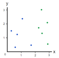
Let’s take a quick look at how a classification tree would make splits to minimize Gini impurity. Below is a small dataset consisting of 10 observations, half blue, half green. The task is to create a decision tree classifier to predict if an observation is green or blue.
The first step is to calculate the impurity of our dataset as it currently stands. To do this, we will take the sum of the proportion of blue points multiplied by the 1 minus the proportion of green points:
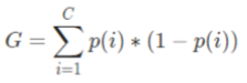
We know that these proportions are 0.5 since the 10-observation dataset is split evenly, letting us easily calculate the Gini impurity as:
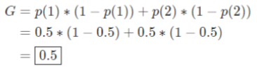
A split will be made using only one variable to begin. To calculate the importance of the variable according to Gini, we will make the split and then repeat the equation for each side of the split with the formula we laid out above. To keep it intuitive, let’s assume we make a perfect split. We would then calculate the Gini impurity on each side:
To calculate the Gini importance, we simply subtract the remaining Gini impurity, 0 + 0, from the original Gini impurity: 0.5 – 0 = 0.5. Thus, a higher value would indicate that the variable has more importance according to this metric.
Let’s consider an imperfect split:
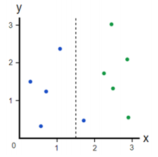
Since the left side of the split is perfect, we know its impurity is 0. On the right side of the split, we calculate:
The final step of the process is to weight each terminal node of the split by the proportion of variable that it represents. This would lead to weighting the left side by 0.4, since it represents 40% of the observations, and the right side by 0.6, which represents 60%. Put simply, this lets us measure Gini importance in a way where we are giving more emphasis to splits that are not only correct but correct across a large amount of the population. This gives us our weighted new Gini impurity after a split:
And finally, we can calculate Gini importance again with:
We can use this type of measure with random forests as well, but instead of only considering 1 tree, we are computing the importance of the variable by adding its importance across all the trees in the forest where it is used in some split. The same process can also be used for regression trees, but instead of monitoring Gini impurity, we can evaluate the decrease in mean squared error or mean absolute error after splits.
Although we can use Gini importance or entropy for boosted trees, there are some downfalls to this:
- There is no “directionality” in the analysis. A variable can be deemed as “important”, but in which direction? Did it help, or hurt a prediction?
- The importance measure is “global”. It takes into consideration the importance of the variable to the population. Wouldn’t it differ for specific observations? Or shouldn’t it account for interactions between variables?
Linear and logistic regression do give us some directionality. However, the coefficients are again global representations found across the population – they are not observation specific. There is directionality in the coefficients; TD’s per game is positive, INT’s per game is negative, but they are static. There is no consideration that, while a team may be passing more per game, they’ll also be subject to higher INT’s. But perhaps they also tend to score a lot of points, which should also be considered. How can we dive deeper into a black-box model and uncover things like directionality and variable interactions at a local and global level?
Introducing Shapley Additive Explanations, a novel, state-of-the art machine learning explainability library, otherwise known as “SHAP”. Shapley values are based on a concept that comes from game-theory, which requires two significant things: games and players. In a predictive model, we would view the game as the objective of the model, or what we are predicting. The players in the game would be our independent variables. The goal of SHAP is to quantify the marginal contribution that each independent variable makes in an individual game. Therefore, SHAP interprets each observation as an individual game, allowing for not only global, but local interpretability. In other words, we can analyze how variables tend to affect the model across the population, but also for individual games.
SHAP accomplishes this by considering every possible combination of independent variables that are used to predict a single observation by order of permutation. For example, if we have a model with three features: X, Y, and Z, SHAP will consider:
• How does the model perform with X?
• How does it perform with X, and then Y?
• How does it perform with X, and then Y, and then Z?
And so on.
Fundamentally, SHAP is making separate predictive models with all different combinations of the features, which allows SHAP to find the marginal contribution of a single feature. Let’s analyze a power set that visually shows a problem where we are predicting someone’s income based on age, gender, and job. Each box, or node, below represents and individual predictive model using a different combination of the variables:
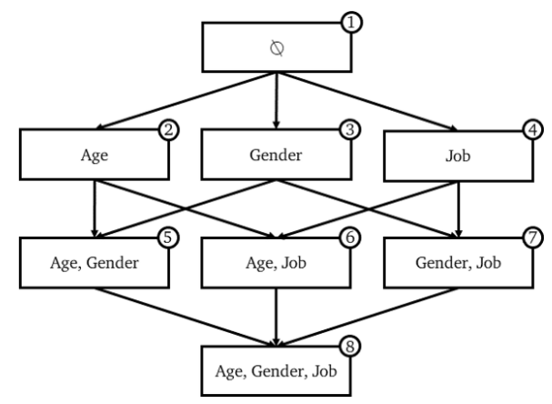
Each of these 8 models will likely have at least slightly different outcomes. The edges, or the lines connected from one model to another, represent the marginal contribution of a feature. How is this computed?
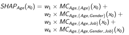
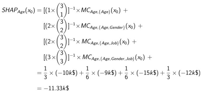
Let’s say we are in node #1, where the model has no features. This would simply take the average salary of our population, say, $50k. If we move to node #2, we add age as our variable, and we will assume this prediction is $40k. This would mean that the marginal contribution for age moving from node #1 to node #2 is -$10k. In order to obtain the total marginal contribution of age, or any other variable, we will have to find the marginal contribution in each node where age is present.
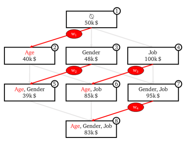
Which will give us our final SHAP values for a given variable, in this case age, as:
The final step is to add weights to these edges. The idea of this is that the weights of the marginal contributions should be equal to the sum of the weights of all the other marginal contributions based on the number of features we added. So, when we go from node #1 to our second layer in the power set, we can see that there are 3 edges: one edge to node #2, one to node #3, and one to node #4. However, there are six edges in the second layer, and three edges in the third. Therefore, the weights on our top layer are 1/3, where the second layer weights are given 1/6, and the final layer is given 1/3 again:
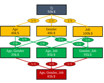
This will give us our final SHAP values for a given variable, in this case age, as:
And finally, we are finished! This same logic can easily be applied to other machine learning problems, like predicting winners and losers in a game, or spreads. We can also use these values to determine feature importance across our population both globally and locally. First, let’s look at the SHAP summary plot for the model that predicts game winners and losers. The summary plot module in the shap library allow us to get a good feel for how variables tend to affect the population as a whole:
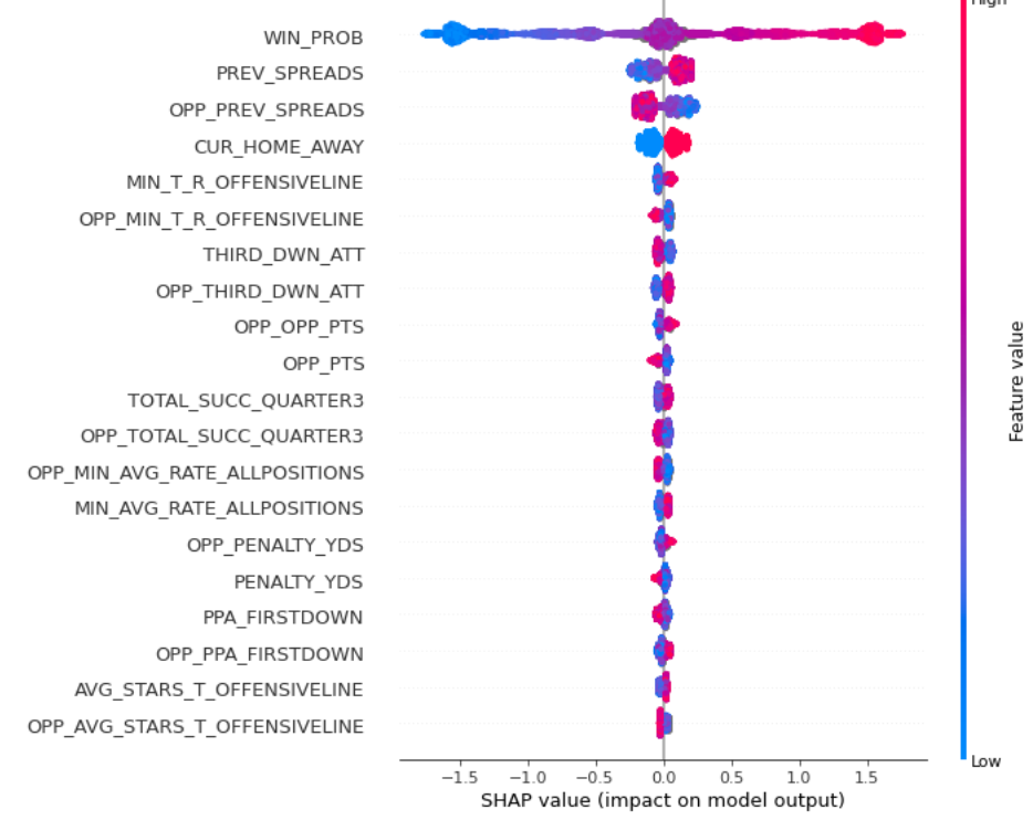
While this graph may seem daunting at first, it is actually very intuitive. The actual feature value, what we would see if we looked at the data in the data frame, is represented by color. Higher values are represented in red, and as variables decrease in actual value, they approach the color blue. On the left y-axis, we can see the variables that are listed (this plot shows the top 25). On the x-axis, we see the SHAP values ranging from negative ~1.5 to positive ~1.5. A higher SHAP value indicates that the prediction was pushed higher, where a lower SHAP value indicates the opposite. Let's look at our WIN_PROB variable, the most influential variable in the model since it is listed at the top. WIN_PROB is the pregame win probability given to me by @CFB_Data, which is available for most games. As pregame win probability increases (indicated in red), SHAP values tend to increase (indicated by the x-axis), which generally pushes the prediction up towards a higher value. I labeled wins as 1 and losses as 0, so this means that this type of interaction makes sense: if a team is favored to win pregame, it generally pushes the prediction closer to 1, or a win. Let's also look at MIN_T_RATING_OFFENSIVE_LINE. As discussed in post 1, I include recruit information. This variable is the minimum total rating of offensive lineman commits over the last 4 years. Although slight, we can see as the minimum total rating increases, the SHAP value also increases, pushing the model to predict a win. This also makes sense: a better OL is probably indicative of a team that is more likely to win.
Here is the spread prediction SHAP summary plot:
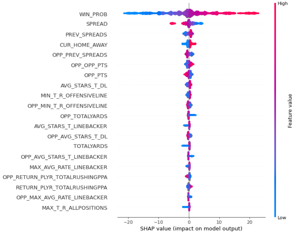
We can see again that pregame win probability is a very significant variable. But let's look at the variable SPREAD. This is the pregame spread again drawn from @CFB_Data, largely available for most observations. To predict the actual spread, I regress towards the difference between the team's points and the opponent's points. So when I receive a prediction for a game, say, Oklahoma's predicted spread = 10.42, I would say the spread is Oklahoma -10.42. We can see that as the pregame spread decreases in value (blue), the SHAP values tend to increase (further to the right on the x-axis), pushing the predicted spread higher. This also makes sense, as favored teams in the model will have a negative pregame spread, such as Ohio State -15.
There is also a second advantage of SHAP summary plots that I'd like to quickly touch on. In all machine learning models, we want to make sure that our models are not overfit. In other words, if we received an AUC of 0.8 on train, we wouldn't want to see and AUC of 0.7 on test. We can also monitor for overfitness in some sense with SHAP and make sure that the model is finding the same patterns in unseen data as it saw in our train set by comparing summary plots from our train set and hidden datasets. An ideal model would show similar summary plots on both populations, ensuring that our model is doing in production what it was taught to do during training.
You'll notice in the plots above that there tends to be a "thickness" around some variables and their SHAP values. The reason for this thickness is that the lines in the summary plots above are actually individual SHAP values for variables of specific games! If you look closely, these values are represented by tiny dots. Thickness just shows that there are more games that have a specific variable value, like WIN_PROB, that derived a similar SHAP value. Since this is the case, we can also dive into specific observations and which variables played a role in the prediction. Let's look at an instance plot for the Clemson vs. Notre Dame game, where Clemson was given a 72% probability of winning by the model.

We can see that the pregame win probability variable was the main driver in the prediction, pushing the prediction up. Clemson's average previous spreads per game, which was 30.57, was another key driver in predicting a Tigers' W. Additionally, the average stars from their recruited wide receivers, AVG_STARS_T_RECEIVER, was another significant and positive driver. On the other side, we can see that Notre Dame's previous average spreads, OPP_PREV_SPREADS (indicated in blue), worked against the model predicting a Clemson win. OPP_PREV_SPREADS is the average spread that a team had in previous games. In this case, it would be calculated as Notre Dame points - their opponent's points. CUR_HOME_AWAY = 0 is a reference to Clemson being the away team, which also hurt their probability of winning. Interestingly enough, and as we have seen throughout the year with ND's stellar wide receivers, the Irish overall average recruit stars for their receivers was another significant factor that worked against Clemson.
I hope you enjoyed the post, and thank you for reading! If you are interested in working with SHAP yourself, there is great documentation on the Github link below. As always, feel free to reach out with questions or comments @CFB_Spreads on Twitter!
Sources: