Making charts with Plotly and the CFBD Python library
It's been awhile since I've done one of these. If you're familiar with my Talking Tech series, this entry will be much shorter. If you follow me on Twitter, you may have seen that the official CFBD Python client library dropped this past weekend.
Introducing the official CFBD Python client library!
— CollegeFootballData.com (@CFB_Data) June 27, 2020
Much like the official libraries for .NET and JavaScript, the Python client will automatically update whenever the API does so it will always have the most up-to-date features available.
Docs: https://t.co/3Ihy91twtI
One of the benefits of using a client library is that it has models and methods pre-populated, making everything nice and accessible. A further benefit of officially supported CFBD client libraries is that they automatically update whenever changes are made to the API, so you're never missing out on any new data or functionality. The Python library joins officially supported JavaScript and .NET CFBD API wrapper libraries. Be sure to check out the documentation on GitHub to see everything available. In this post, we're going to walk through using the new library with Plotly to generate some nice charts.
Plotting returning production against offensive ratings
For this exercise, we're going to be plotting returning production data against final offensive ratings for the 2019 season and look for correlations. We'll be using the returning production data that recently dropped on CFBD. Please note that this data only runs up through the 2019 season (i.e. returning production from 2018 to 2019). Returning production data for 2020 should be available soon after rosters are posted in August. For offensive rating, we'll be using Bill Connelly's SP+ offensive ratings, also available on CFBD (and therefore through the Python package).
First thing's first, we need to install the Python package. If you're familiar with PyPi, it's no different than installing any other package through pip.
pip install cfbdI'm going to be writing my code in a Jupyter notebook. I just find it makes it easier to view data as I'm grabbing and transforming it. If you've following along with any of my previous blog posts, then you should be no stranger to using Jupyter, though it's not a hard requirement for this exercise. To start off, we need to import the libraries we'll be using.
import cfbd
import pandas as pd
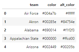
import plotly.graph_objects as goNow we can start digging into some data. The first bit of data I want to grab is a list of FBS teams. I don't really care about FCS and lower division teams since we're working with a largely FBS dataset. Another reason I want to grab this list is so that I can grab team colors. These will come in handy when formatting my charts. The library makes this pretty straightforward.
api = cfbd.TeamsApi()
teams = api.get_fbs_teams()
teams_df = pd.DataFrame.from_records([dict(team=t.school, color=t.color, alt_color=t.alt_color) for t in teams])
teams_df.head()
Note that the library will return a list of team models, which I would then like to load into a pandas DataFrame. You can see above how I used the from_records method in pandas to create a DataFrame from the data, but not before converting the models into a list of dict objects. You may also notice that I selected out the team name and color properties in order to keep things clean. There's a lot more data being returned and I don't necessarily need all of it, so I take what I need. At any rate, your output should look like below.
Next thing I want to grab is team returning production data from the library's players API. You'll notice that the code looks very similar to that above with one distinct difference. I'm grabbing all fields from the returning production model. There's a lot of data being returned here and I'm not totally sure which data I'm going to need as I want to experiment with different returning production data points. Is returning pass production more closely correlated with offensive success than returning rushing production? I don't know, but I'd certainly like to find out.
api = cfbd.PlayersApi()
production = api.get_returning_production(year=2019)
production_df = pd.DataFrame.from_records([p.to_dict() for p in production])
production_df.head()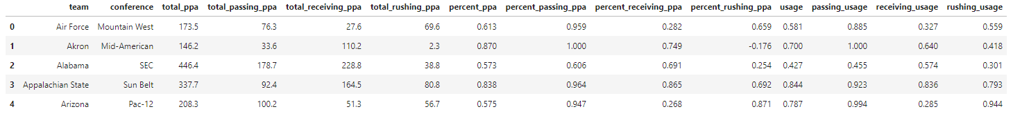
Now we just need to combine our team and production dataframes so that we can have team color information and returning production data accessible in the same dataframe. If you're familiar with pandas, it's fairly simple.
df = teams_df.merge(production_df, left_on=['team'], right_on=['team'], suffixes=['', '_'])
df.head()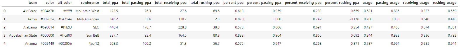
The only data left to query is SP+ ratings for the 2019 season. This is largely going to be just as simple as our previous two API queries, but with one minor caveat. We'll get to that in a moment. For now, go ahead and query the data using the ratings API class.
api = cfbd.RatingsApi()
ratings = api.get_sp_ratings(year=2019)
ratings_df = pd.DataFrame.from_records([r.to_dict() for r in ratings])
One thing you may notice after running that is that there's no easy way to select a team's offensive rating since the data structure wasn't fully flat. Instead of a rating number under the offense column, you'll see a nested object containing various offensive ratings. Let's go ahead and create a new column in our ratings dataframe to pull out the overall offensive rating for each team. We can use the pandas apply method to accomplish this.
ratings_df['offense_rating'] = ratings_df[['offense']].apply(lambda x: x.offense['rating'], axis=1)
ratings_df.head()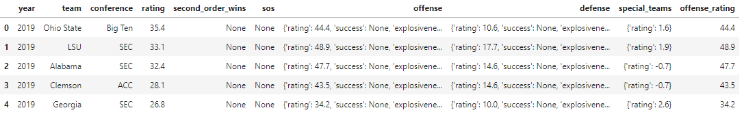
We now have all of our data. Only last thing we need to do is to merge our ratings data onto our main dataframe. You'll notice that as I do this, I first whittle the ratings dataframe down to relevant columns I want to carry over.
df = df.merge(ratings_df[['team', 'rating', 'offense_rating']], left_on=['team'], right_on=['team'], suffixes=['', '_'])
df.head()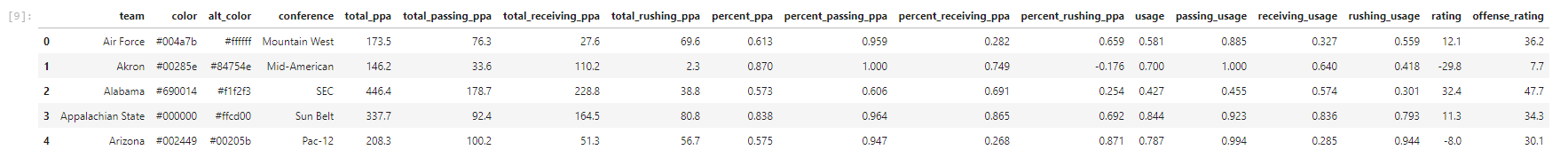
One last thing that I noticed is that there are a few teams missing a value for the alt_color property. We can use the fillna method to fill these in with the hex code for white.
df['alt_color'].fillna('#ffffff', inplace=True)We should now be good to start generating some charts. First thing I want to do is plot overall returning production against final offensive SP+ rating. We're going to use the total_ppa column to do this. This will give us the total offensive EPA each team had returning at the start of the 2019 season. Go ahead and run this code.
fig = go.Figure()

fig.add_trace(go.Scatter(
    x=df['total_ppa'],
    y=df['offense_rating'],
    text=df['team'],
    mode='markers',
    marker=dict(size=7, color=df['alt_color'], line=dict(width=3, color=df['color']))
))

fig.update_layout(title='Final Offense SP+ Rating vs Returning Offense EPA',
                   xaxis_title='Returning EPA',
                   yaxis_title='Offensive SP+ Rating',)

# Show that chart!
fig.show()
You'll see we used total_ppa for our x-axis value and offense_rating for our y-axis. We also used team colors to stylize the team markers on the chart. Ideally, we would use team logos as plot markers but I haven't found a good way to do that with Python. If you do, hit me up! Anway, here's our output.
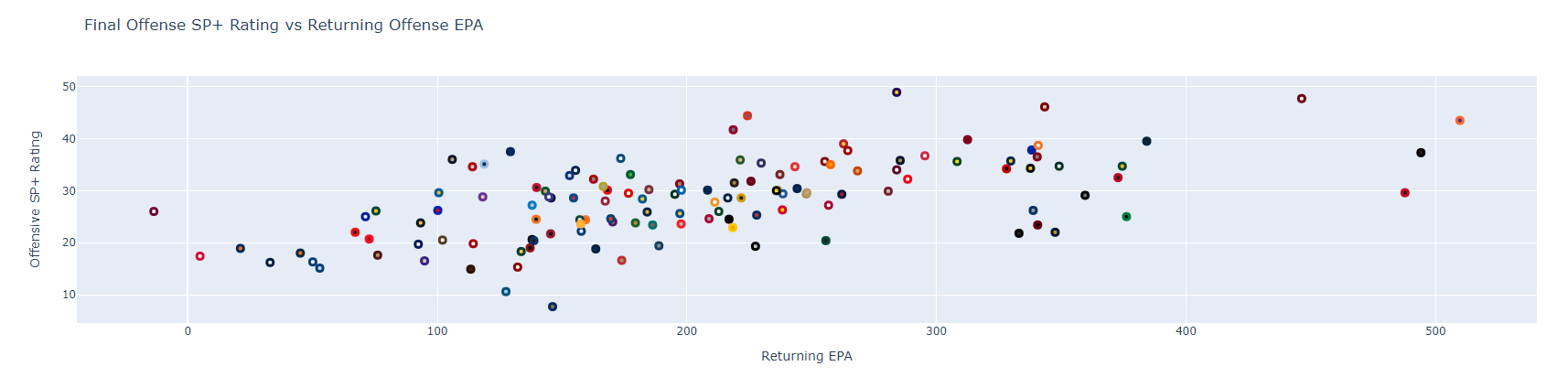
Pretty interesting. On the surface, there does seem to be some level of loose correlation between returning production and final SP+ offensive rating. What happens if we change our x-axis to plot against pass production? The code for that will be identical, save for swapping out the dataframe column we're using for our x-axis value.
fig = go.Figure()

fig.add_trace(go.Scatter(
    x=df['total_passing_ppa'],
    y=df['offense_rating'],
    text=df['team'],
    mode='markers',
    marker=dict(size=7, color=df['alt_color'], line=dict(width=3, color=df['color']))
))

fig.update_layout(title='Final Offense SP+ Rating vs Returning Passing Offense EPA',
                   xaxis_title='Returning Passing EPA',
                   yaxis_title='Offensive SP+ Rating',)

# Show that chart!
fig.show()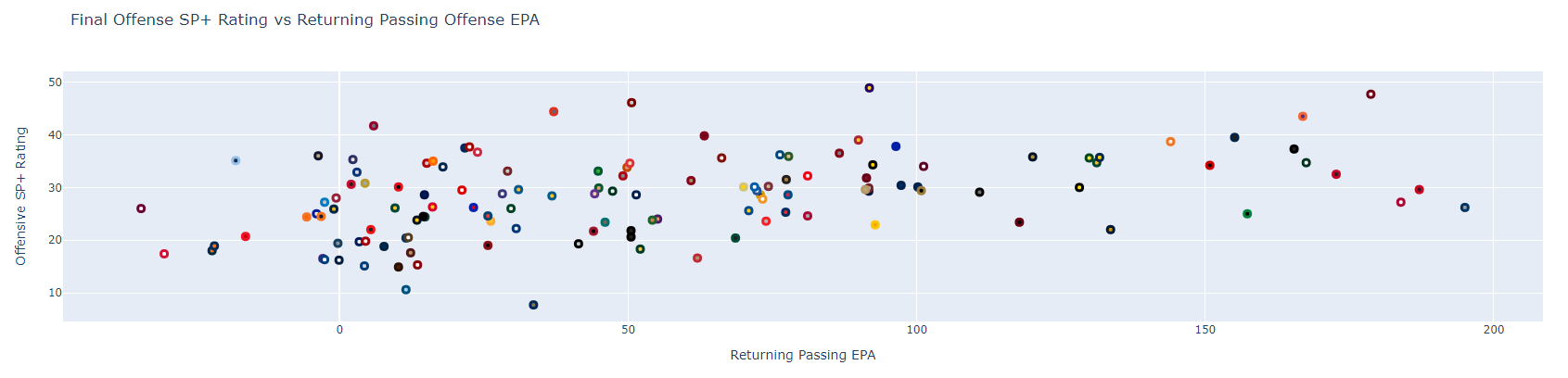
The correlation here looks a bit looser than the one above. Note that you can hover over any of the markers to view the team names. Feel free to play around with that more. An interesting next step may be to swap out pass production with rushing or receiving production. There are several other data points in our dataframe you can also give a go, mostly pertaining to player usage. I'll leave you to it for now.
And that's pretty much all there is to it. I've uploaded my Jupyter notebook for this exercise to GitHub, so be sure to check it out. And lastly, be sure to tag me on Twitter (@CFB_Data) with any sweet charts you make. I love to share what people are doing. Happy charting!