Talking Tech: Creating Geo Charts
In this guide, we'll walkthrough how to create geo charts using the Cartopy and Matplotlib libraries in conjunction with the CFBD Python library, taking advantage of CFBD's recruit and player location data.
About a year ago, I had acquired a large volume of hometown location data for recruits and players. I'm not just talking about things like city and state. That's always been available on the CFBD site. Specifically, I'm referring to latitude and longitude data as well as county FIPS codes. Well, it turns out that I got so into playing around with the data and learning how to plot data on maps, I forgot to make said data publicly available on CFBD until recently. Oops.
The cool thing about this type of data is that it opens up a world of possibilities. You can plot the hometowns of blue chip recruits on a map, for example:
Where were the 2021 blue chips from and where did they commit?
— CollegeFootballData.com (@CFB_Data) April 8, 2021
Higher rated players stack on top of lower rated in this map. pic.twitter.com/2HS8o2jW8b
Or you could generate some type of choropleth map:
What states produce the most HS talent per capita? Alabama and Louisiana are in a dead heat for the top spot with Georgia not far behind.
— CollegeFootballData.com (@CFB_Data) July 10, 2020
SEC footprint clearly outproduces any other region if the experts are to be believed. pic.twitter.com/0nFto7ligu
So you think you're interested in learning how to create these types of geo charts? Well, you're in luck because that is the focus of this edition of Talking Tech. If you want to follow along with the Jupyter notebook I create for this post, you can grab it off of GitHub.
Charting Libraries
If you've made any sort of chart in Python before, you're problem familiar with the plethora of libraries available. If you've been following along in this series, two of my favorite charting libraries for Python are Plotly and matplotlib. Both libraries are super robust and can be used for just about any type of chart and then some, but they each have different strengths and weaknesses. When I first started coding in Python, I found myself gravitating towards Plotly. For one, I was already pretty familiar with it due to its ubiquity. Like CFBD, Plotly is more of a platform that has several wrapper libraries for different languages, such as Python, R, and JavaScript. I was already familiar with its JavaScript library to an extent. Another great thing about Plotly is that is has just about everything right out of the box (including maps!) with very little need for further tweaking. If you're a Python beginner, it's a great library to look into. In fact, I highly recommend checking out my previous post on using Plotly with the cfbd Python library.
Lately, however, I've found myself gravitating more towards matplotlib. Don't get me wrong, Plotly is still a great library and I still use it a ton. And while Plotly may be the most comprehensive library in what it provides right out of the box, it lacks in customization. If you want to do any sort of customization or tweaking, Plotly can be very hit or miss. Matplotlib, on the other hand, is lightweight and much more extensible. One thing it does not provide out of the box is geo charts, but that's not a problem. Due to its extensibility, there are several libraries built on top of matplotlib that focus exclusively on maps with all of the functionality matplotlib provides. One such library is cartopy, which we will be working with in this post. Now, building out geo charts with cartopy and matplotlib may not be nearly as straightforward as just using Plotly, but that's what I'm here to help you with. It's pretty straightforward once you've set things up. And we'll go into more detail in a bit for why I choose to use the matplotlib/cartopy combo for this task.
Playing around with Cartopy
First things first, let's install that cartopy library. Please note, cartopy should be installed via conda. If you are using my environment image from DockerHub, conda is already preloaded. If you don't use conda and instead use pip, you may run into some issues getting cartopy or some of its dependencies installed. I know because this happened to me and I had to start fresh.
conda install cartopy
Next up, let's upgrade the cfbd Python library to the latest version. We'll need to do this to ensure we can input our API key later on. May as well install it while we have terminal up and running.
pip install cfbd --upgrade
Now, let's spin up a new Jupyter notebook (or create a new Python script in your IDE of choice) and start playing around with cartopy. We'll start off with all of the import statements we are going to need. I know some people like to write imports in their code as they need them, but I think it's a good practice to put them all at the top of the script. Keeps things organized and is just much cleaner, in my opinion.
import cartopy # main cartopy library
import cartopy.crs as crs # cartopy map projects
import cartopy.feature as cfeature # cartopy map features
import cfbd
import matplotlib.pyplot as plt # pyplot module of matplotlib, for use with cartopy
from matplotlib.offsetbox import OffsetImage, AnnotationBbox # will allow us to make our map badass with team logos
import numpy as np
import pandas as pd
Time to see what all we can do! See the line of code below. We are creating a standard matplotlib plot object and defining some axes. What is different about this line of code is that we are also passing in a projection value. We'll get more into what this is a minute. For now, just run the code.
plt.axes(projection=crs.AlbersEqualArea())

Umm, what the heck is this? This is actually is a map of the earth, but it's blank. We need to tell cartopy which features we want rendered on the map. This is where the cfeatures import comes into play. Let's add some land and some ocean to our map.
ax = plt.axes(projection=crs.AlbersEqualArea())
ax.add_feature(cfeature.LAND)
ax.add_feature(cfeature.OCEAN)
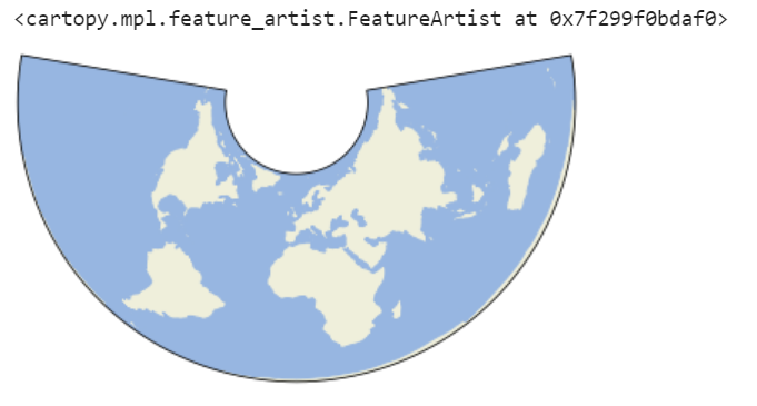
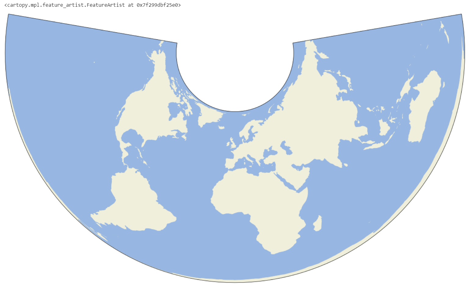
That looks much better, doesn't it? But what's with the weird shape? Short of going into a lesson on non-Euclidean geometry, recall that the Earth is a sphere and thus cannot be mapped onto a flat surface. We come up with various ways of projecting the curved surface of the Earth onto a flat plane. Remember the projection parameter I mentioned above? This is were that parameter comes into play. Cartopy comes with several built-in projections. This one is called the Albers Equal Area projection. Let's try a few of these, shall we? I'm sure you've heard of or are familiar with the famous Mercator projection.
ax = plt.axes(projection=crs.Mercator())
ax.add_feature(cfeature.LAND)
ax.add_feature(cfeature.OCEAN)
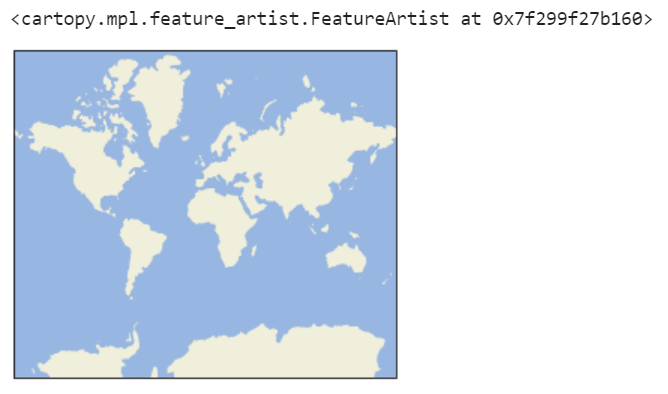
The Robinson projection is another fun one.
ax = plt.axes(projection=crs.Robinson())
ax.add_feature(cfeature.LAND)
ax.add_feature(cfeature.OCEAN)
But we're going to stick with the Albers Equal Area projection. We'll obviously need to make a few modifications. Does the final image seem small to you? That's something we can easily fix.
plt.figure(figsize=(24, 12))
ax = plt.axes(projection=crs.AlbersEqualArea())
ax.add_feature(cfeature.LAND)
ax.add_feature(cfeature.OCEAN)
That's much better. Notice how this is an entire world map. We're not always going to want a map of the whole world are we? Especially for working with any sort of college football data. Let's limit our map to a specific area of the world, the contiguous United States in this instance. Now, this gets a little tricky as we are going to be dealing with latitudes and longitudes. Namely, we want to find which latitudes and longitudes should be the bounds for our map. Luckily, I've already figure that out for you.
plt.figure(figsize=(24, 12))
ax = plt.axes(projection=crs.AlbersEqualArea())

extent = [-120, -70, 22, 51]

ax.set_extent(extent)

ax.add_feature(cfeature.LAND)
ax.add_feature(cfeature.OCEAN)
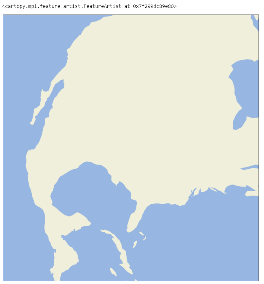
That's definitely what we are looking for. What's happening above is that we are specifying the minimum and maximum latitude and longitude values we want shown. These are represented in the extent array. The first two values correspond to min/max latitude in degrees and the final two to min/max longitude. But everything's at a weird angle. If you compare to the full map above, you'll see that it pretty much just took a slice out of that map without making any orientation adjustments. Again, this is something we are going to need to specify.
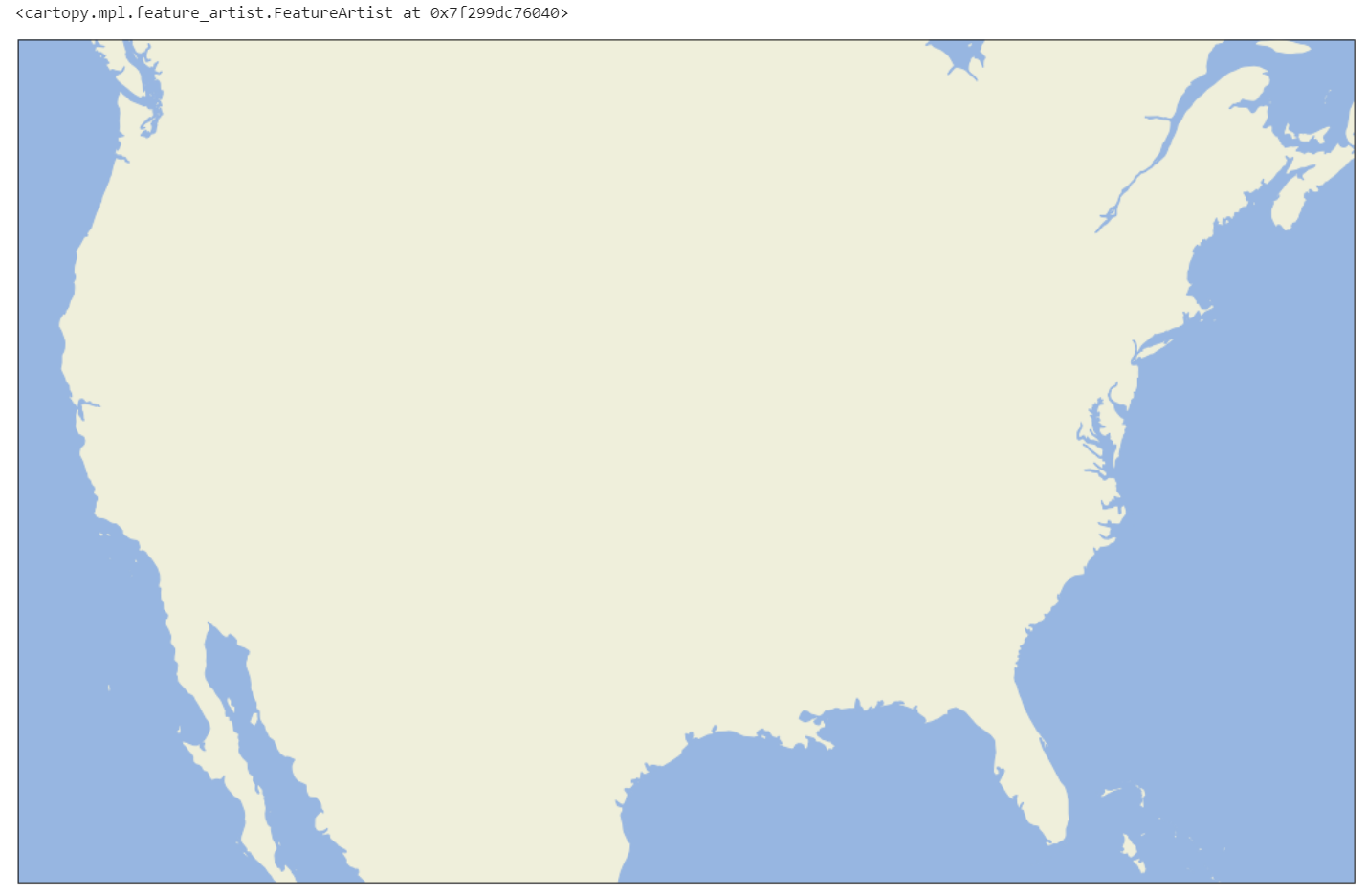
We're going to do some rearranging of our code, but the basic idea is that we want to find the center point of our map. We should easily be able to calculate the central latitude and longitude values from the extent array we defined above using numpy. We'll then pass those values into our projection.
plt.figure(figsize=(24, 12))

extent = [-120, -70, 22, 51]

central_lon = np.mean(extent[:2])
central_lat = np.mean(extent[2:])

ax = plt.axes(projection=crs.AlbersEqualArea(central_lon, central_lat))
ax.set_extent(extent)

ax.add_feature(cfeature.LAND)
ax.add_feature(cfeature.OCEAN)
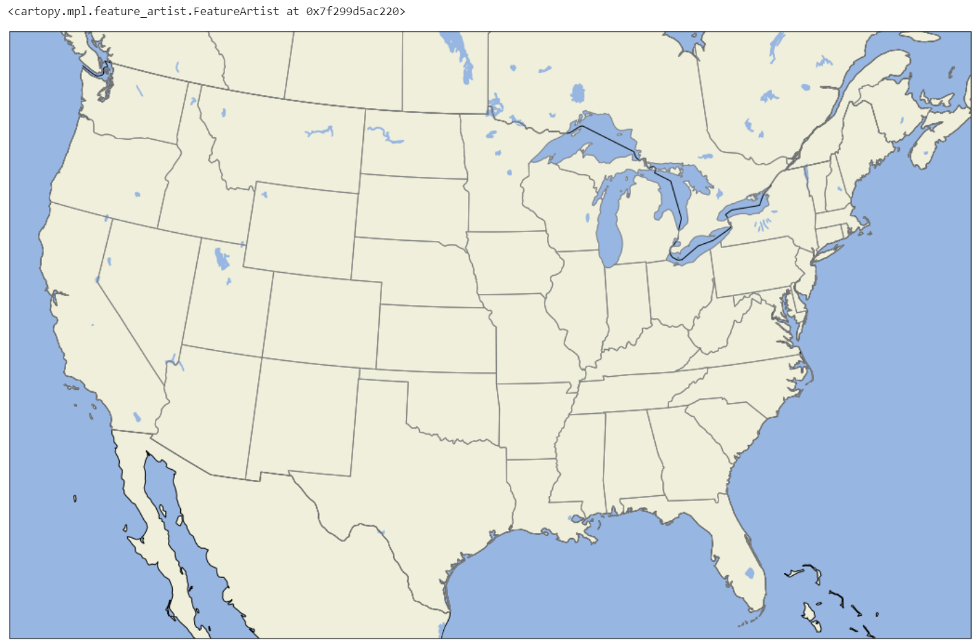
We're in a pretty good place now. Before we move onto the data portion of our code, I'd like to make a few tweaks to the map. Remember the cfeature submodule we used to render land area and the ocean? We can use that same submodule to add all sorts of other geographic features, such as rivers, major bodies of water, and borders.
plt.figure(figsize=(24, 12))

extent = [-120, -70, 22, 51]

central_lon = np.mean(extent[:2])
central_lat = np.mean(extent[2:])

ax = plt.axes(projection=crs.AlbersEqualArea(central_lon, central_lat))
ax.set_extent(extent)

ax.add_feature(cfeature.OCEAN)
ax.add_feature(cfeature.LAND, edgecolor='black')
ax.add_feature(cfeature.LAKES)
ax.add_feature(cfeature.BORDERS)
ax.add_feature(cfeature.STATES, edgecolor='gray')
Querying Data
Now we can dig into actually querying some data and applying it to our map. Since my last Talking Tech post, we are now requiring API keys for any interaction. If you haven't yet done see, go ahead and grab your free API key. We'll require just a few lines of code to setup the cfbd Python library to use our API key.
configuration = cfbd.Configuration()
configuration.api_key['Authorization'] = 'your_api_key_here'
configuration.api_key_prefix['Authorization'] = 'Bearer'
client = cfbd.ApiClient(configuration)
The above code sets up our API token and creates a reusable client instance which we'll use for the rest of this guide when performing data operations against CFBD. For the rest of this post, I'm going to walk you through generating a map like the one above with all of the recruit and commit locations.
Where were the 2021 blue chips from and where did they commit?
— CollegeFootballData.com (@CFB_Data) April 8, 2021
Higher rated players stack on top of lower rated in this map. pic.twitter.com/2HS8o2jW8b
Now that we have the cfbd Python module updated and setup up, it should be trival to grab a list of high school recruits from the class of 2021.
year = 2021
classification = 'HighSchool'

api_instance = cfbd.RecruitingApi(client)
croots = api_instance.get_recruiting_players(year=year, classification=classification)

croots[0:2]
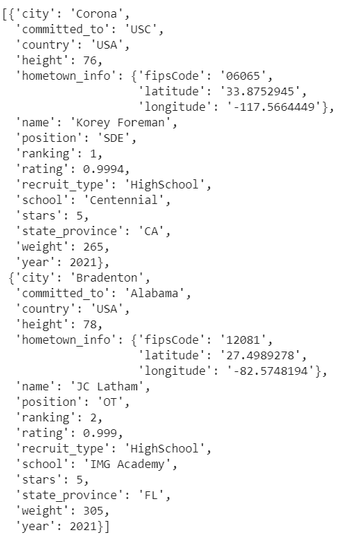
We only need a subset of this data to create our map chart. I'm going to load the data we do need into a pandas DataFrame object. This includes rating, committed school, latitude, and longitude data.
df = pd.DataFrame().from_records([
    dict(
        rating=c.rating,
        stars=c.stars,
        college=c.committed_to,
        lat=c.hometown_info['latitude'],
        lon=c.hometown_info['longitude'])
    for c in croots
    if c.state_province is not None and len(c.state_province) == 2 and c.state_province != 'AS' and c.state_province != 'QC' and c.state_province != 'HI'])

df.head()
I'm also doing some filtering here. I only care about recruits from the contiguous 48 states. All U.S. state abbreviations are exactly two characters, so I am filtering out any data that doesn't meet this criteria. I'm additionally filtering out Hawai'i and Canadian provinces.
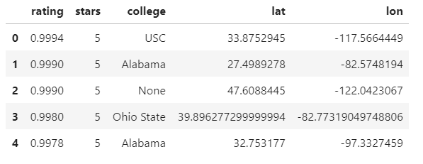
I'm also going to bring in some team data so that I can render team logos on my map. I have a folder of team logos where the names of the logos are in the format of {team_id}.png. So we really just need the team id of each recruit's committed school. Let's also throw in conference labels since I may want to make some conference specific maps.
teams = cfbd.TeamsApi(client).get_teams()
teams_df = pd.DataFrame().from_records([dict(team_id=t.id, team=t.school, conference=t.conference) for t in teams])

df = df.merge(teams_df, left_on='college', right_on='team')
df.head()
We now have all the data we need so it's time to plot some points on our map. We need to copy all of our map code up above and tack on the following:
plt.scatter(
    x=df.lon.astype('float64'),
    y=df.lat.astype('float64'),
    transform=crs.PlateCarree()
)
What's this code doing? It's basically overlaying a scatter plot over top of the map we created. The longitude value serve as our x-coordinates; the latitudes as our y-coordinates. You may have noticed that we are passing in another transform parameter, similar to when we were rendering our map. Basically, we need to translate our coordinates to fit onto the projection we had previously chosen. Notice that we went with a different projection to translate our points, the Plate Carree projection. I'm not really sure why this is. I know that Plate Carree is another equal area projection, similar to the Albers Equal Area projection. My speculation (which is probably totally wrong) is that when we sliced out a piece of our Albers Equal Area projection map along straight longitudinal and latitudinal lines, it became a Plate Carree projection because I know that Plate Carree maps longitude and latitude to straight lines on a flat plane, like our final projection. Like I said, that's just my speculation and I'm probably completely wrong in that assumption. I just know that this is what works. If someone more knowledgable in map projections knows the answer to this, please do reach out because I would love to know.
Anyway, our current map code should look like this altogether.
plt.figure(figsize=(24, 12))

extent = [-120, -70, 22, 51]

central_lon = np.mean(extent[:2])
central_lat = np.mean(extent[2:])

ax = plt.axes(projection=crs.AlbersEqualArea(central_lon, central_lat))
ax.set_extent(extent)

ax.add_feature(cfeature.OCEAN)
ax.add_feature(cfeature.LAND, edgecolor='black')
ax.add_feature(cfeature.LAKES)
ax.add_feature(cfeature.BORDERS)
ax.add_feature(cfeature.STATES, edgecolor='gray')

plt.scatter(
    x=df.lon.astype('float64'),
    y=df.lat.astype('float64'),
    transform=crs.PlateCarree()
)
Adding Logos
This looks pretty awesome, right? But it would look even cooler with some team logos so we can see where each recruit committed. This section is the whole entire reason we are using matplotlib/cartography as opposed to Plotly. Thus far, I have not been able to find a way in Plotly to replace plot points with any sort of custom image. Matplotlib may require extra boilerplate to get setup, but it enables doing something like this which makes the set up well worth it, in my opinion.
If you follow me on Twitter (@CFB_Data), you may remember a Gist I posted awhile back about rendering logos as data points on a scatter plot. We're going to heavily base this section on that code. As mentioned previously, I have a folder in the root directory of my script called logos which contains all team logos in the filename format of <team_id>.png. The following code is dependent on having such a folder in said location. It just so happens that I have this set of logos in this convention publicly available in a Google Drive. You can find it available here for download. There are two sets, one with images that are 24px by 24px and the other 32px by 32px. Pretty sure I'm using the 32px set in this demo here.
We need to define a function which, given a team id, will return the path of the corresponding image. Matplotlib has an imread method that will read the image into memory based on the path. We'll then wrap it in another matplotlib object called an OffsetImage which will allow the image to be rendered on our chart.
def getImage(id):
    return OffsetImage(plt.imread("./logos/{0}.png".format(id)))
Next, we need to add some code to our map rendering code that will use this function and render the logos on the map.
transform = crs.PlateCarree()._as_mpl_transform(ax)
for x0, y0, path in zip(roster_df.lon, roster_df.lat, roster_df['team_id']):
	ab = AnnotationBbox(getImage(path), (x0, y0), frameon=False, xycoords=transform)
    ax.add_artist(ab)
Let's walkthrough what this code is doing. The first line defines a transform function. Remember how we had to translate our scatter points from a regular plane and onto our map projection using a map projection function? We need to do the same of the logos, which effectively will replace the points on the map. The first line accomplishes this and stores this transform function in a new variable, transform. Next, we loop through each coordinate in our map along with the associated team_id values. We are going to call our getImage function to get our images and then wrap them in an AnnotationBbox which creates a chart annotation (matplotlib's objects for adding extra data and labels to charts). Notice that we pass in the relevant coordinates, the corresponding logo, and our transform function so that matplotlib knows where to render our images on the map projection. Lastly, we call the add_artist function which renders the annoated image onto our map. Here's our final map code:
plt.figure(figsize=(24, 12))

extent = [-120, -70, 22, 51]

central_lon = np.mean(extent[:2])
central_lat = np.mean(extent[2:])

ax = plt.axes(projection=crs.AlbersEqualArea(central_lon, central_lat))
ax.set_extent(extent)

ax.add_feature(cfeature.OCEAN)
ax.add_feature(cfeature.LAND, edgecolor='black')
ax.add_feature(cfeature.LAKES)
ax.add_feature(cfeature.BORDERS)
ax.add_feature(cfeature.STATES, edgecolor='gray')

plt.scatter(
    x=df.lon.astype('float64'),
    y=df.lat.astype('float64'),
    alpha=0,
    transform=crs.PlateCarree()
)

transform = crs.PlateCarree()._as_mpl_transform(ax)
for x0, y0, path in zip(df.lon, df.lat, df['team_id']):
    ab = AnnotationBbox(getImage(path), (x0, y0), frameon=False, xycoords=transform)
    ax.add_artist(ab)
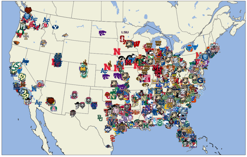
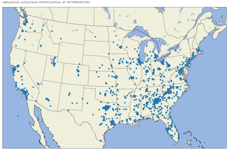
Notice that I added a parameter to the plt.scatter function by setting the alpha parameter to 0. This will ensure that the blue dots from our previous map won't render alongside our logo points, effectively ensuring that the logos replace the regular points on the map. This map looks a little busy, doesn't it? I'm going to make two further adjustments. I'm going to created a filtered version of the DataFrame called filtered and I'm going to: 1) filter out any recruit less than 4 stars (i.e. grab only the blue chips) and 2) order the dataset so that the lower rated players are at the top. Ordering the DataFrame in this way will ensure that logos for lower rated prospects are rendered first and therefore ensure that higher rated prospects take precedence on the map.
filtered = df.query("stars > 3").sort_values('rating')

plt.figure(figsize=(24, 12))

extent = [-120, -70, 22, 51]

central_lon = np.mean(extent[:2])
central_lat = np.mean(extent[2:])

ax = plt.axes(projection=crs.AlbersEqualArea(central_lon, central_lat))
ax.set_extent(extent)

ax.add_feature(cfeature.OCEAN)
ax.add_feature(cfeature.LAND, edgecolor='black')
ax.add_feature(cfeature.LAKES)
ax.add_feature(cfeature.BORDERS)
ax.add_feature(cfeature.STATES, edgecolor='gray')

plt.scatter(
    x=filtered.lon.astype('float64'),
    y=filtered.lat.astype('float64'),
    alpha=0,
    transform=crs.PlateCarree()
)

transform = crs.PlateCarree()._as_mpl_transform(ax)
for x0, y0, path in zip(filtered.lon, filtered.lat, filtered['team_id']):
    ab = AnnotationBbox(getImage(path), (x0, y0), frameon=False, xycoords=transform)
    ax.add_artist(ab)
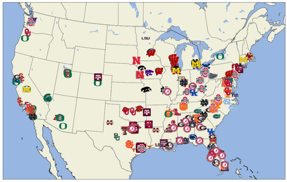
That looks pretty badass. Let's go ahead and extract this code into a function to make it a little more reusable.
def create_map(dataset):
    plt.figure(figsize=(24, 12))

    extent = [-120, -70, 22, 51]

    central_lon = np.mean(extent[:2])
    central_lat = np.mean(extent[2:])

    ax = plt.axes(projection=crs.AlbersEqualArea(central_lon, central_lat))
    ax.set_extent(extent)

    ax.add_feature(cfeature.OCEAN)
    ax.add_feature(cfeature.LAND, edgecolor='black')
    ax.add_feature(cfeature.LAKES)
    ax.add_feature(cfeature.BORDERS)
    ax.add_feature(cfeature.STATES, edgecolor='gray')

    plt.scatter(
        x=dataset.lon.astype('float64'),
        y=dataset.lat.astype('float64'),
        alpha=0,
        transform=crs.PlateCarree()
    )

    transform = crs.PlateCarree()._as_mpl_transform(ax)
    for x0, y0, path in zip(dataset.lon, dataset.lat, dataset['team_id']):
        ab = AnnotationBbox(getImage(path), (x0, y0), frameon=False, xycoords=transform)
        ax.add_artist(ab)
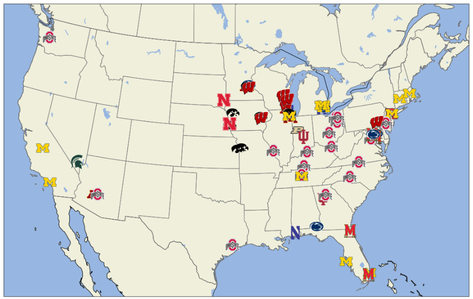
Now creating a custom map is simple!
filtered = df.query("stars > 3 and conference == 'Big Ten'").sort_values('rating')
create_map(filtered)
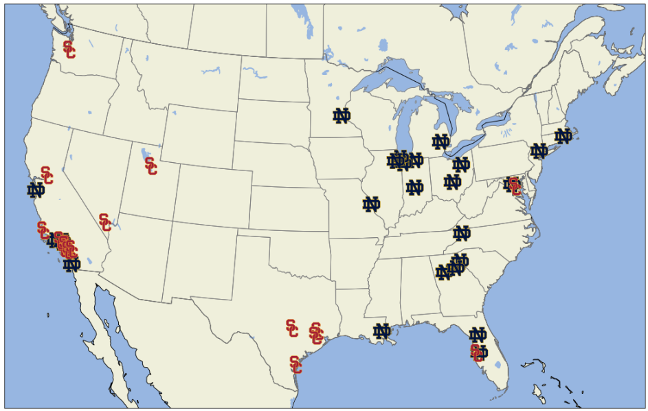
filtered = df.query("team == 'USC' or team == 'Notre Dame'").sort_values('rating')
create_map(filtered)
You also aren't limited to just recruiting data. You can also render maps based on roster data, but I'll leave that to you do figure out.
Interesting to see how much and how little rosters change over the years. Here's an animation of Michigan's roster from 2010 to 2020. pic.twitter.com/VvlFgaKvDl
— CollegeFootballData.com (@CFB_Data) April 8, 2021
What's Next?
Next up, I'll probably be writing up another post about how to create choropleth maps like this one:
What states produce the most HS talent per capita? Alabama and Louisiana are in a dead heat for the top spot with Georgia not far behind.
— CollegeFootballData.com (@CFB_Data) July 10, 2020
SEC footprint clearly outproduces any other region if the experts are to be believed. pic.twitter.com/0nFto7ligu
But I'm really interested to see what you do with all of this. If you make any cool maps, be sure to tag me on Twitter (@CFB_Data) or even feel free to share on Discord or even on reddit (r/CFB_Analysis). I love seeing what people create and will usually RT if you tag me on Twitter. Anyway, have fun and let me know how it goes!