Talking Tech: Charting Data with Plotly

In the last edition of Talking Tech, we created our own rating system using an SRS algorithm. We're going to build off of that work to demonstrate how to plot charts in Python using Jupyter notebooks. Before we get started, we need to find a charting library that will suit our needs. Normally, my go to library is Chart.js, which is absolutely fantastic and has a great feature set. If you are familiar with any of the interactive charts on CollegeFootballData.com, they are all built using this library.
Unfortunately, Chart.js is purely a JavaScript library as it's intended for rendering charts in a web browser using an HTML canvas element. We're going to need to find something different for working in Python. Since there are a myriad of libraries from which to choose and my own experience with Python is very limited at this point, I went to the community for suggestions:
Any suggestions on a good charting library for Python? matplotlib? ggplot? Complete Python newb here.
— CollegeFootballData.com (@CFB_Data) December 30, 2019
Introducting Plotly
Thankfully, I received a lot of really good responses. You can always count on the community to point you in a good direction. There were various libraries recommended in the comments, but a vast majority of them recommended Plotly. This was actually great as I've had exposure to Plotly in the past. In fact, I seriously considered using it for the main CFBD website at one time. Plotly has libraries in JavaScript, Python, and R, so it is a very versatile library to have in your toolbox.
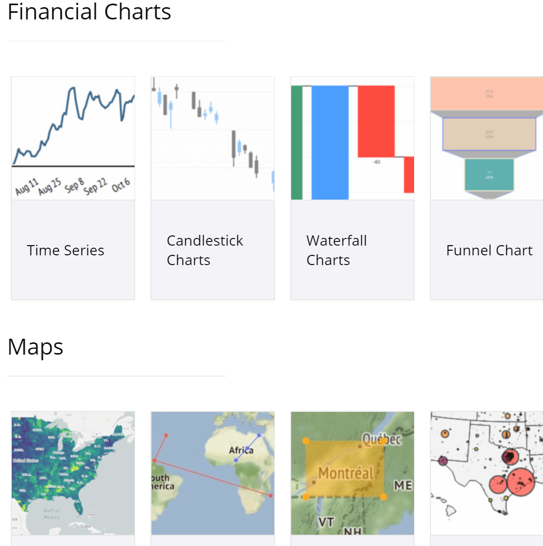
A really nice thing about Plotly is that it is a very mature library with nearly endless options for types of charts it has available. Not only does it include all of your basic charts like scatter plots, line charts, bar charts, and pie charts, but it also includes more obscure statistical, scientific, and financial chart options. Maps and 3-D charts are also builtin. Again, the options are basically endless.
The Plotly library comes in two flavors for Python. The first flavor is the standard Plotly library, also known as the Graph Objects library, with all the bells and whistles and customization options. The second is called Plotly Express and is basically just a high level abstraction of the standard library, making it super simple to get charts created assuming you already have clean data. A basic scatter chart can be created and rendered very easily:
# where df represents a prebuilt pandas DataFrame object with columns named "column_a" and "column_b"
import plotly.express as px
fig = px.scatter(df, x="column_a", y="column_b")
fig.show()
So, Plotly Express seems like the logical choice, right? Well, not so fast. Since Plotly Express is basically a wrapper of the standard Graph Objects library, they can be used interchangeably. I'll usually always start out with Plotly Express when creating charts but continue using the Graph Objects library in situations where I'd like to add further customization and tweaking.
Decisions, Decisions
Time to get to building some charts! Well, not quite. Before we begin, we first need to decide what we want to explore and analyze. This will not only ensure we create meaningful charts but will also dictate what type of charts we will be making. A prominent debate that seems to come up every year in college football right around National Signing Day is the role of recruiting ratings and to what extent they influence both team and individual success. For the purposes of this exercise, let's limit our inquiry to the relationship between recruiting and team success.
Remember the SRS ratings we built last time? This provides a good opportunity to utilize that work. After all, SRS is meant to be an indicator of team strength and is calculated solely based on results on the field. This gives us a good measure for team success, but what about recruiting strength?
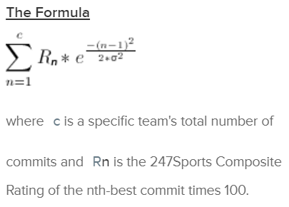
The 247Sports Composite is considered to be the gold standard when it comes to recruiting metrics. What is so special about it? It basically is an aggregation of ratings provided by all major recruiting services, including 247's own ratings. The problem with individual services is that each has their biases and shortcomings. One service might be biased toward a particular region of the country or have better scouting in a particular area. Another service may sponsor different camps for high school football players and exhibit strong bias towards players that participate in their own events. The Composite ratings tend to even these factors out by striking a balance between all services.
Another great thing about the Composite is how it rates classes as a whole. Another ongoing debate in recruiting is how to balance class quality with the volume of recruits in a class. Is a class with just 10 five star prospects better than a full class of 25 three star prospects? 247Sports has a unique way of balancing things out by assigning each recruit in a given class a Gaussian multiplier. Basically, the top ranked recruit in a class is assigned their full value towards a team's overall rating, but as you descend down to a team's lower rated recruits a diminishing multiplier is applied. It's actually quite an elegant way of handling this problem.
This is all well and great, but how exactly do we incorporate these into our analysis? Do we just take a 5-year average of class ratings? How do we account for attrition through transfers and players just not ever showing up on campus for whatever reason? Fortunately, 247Sports also provides a Team Talent Composite. This actually looks at current rosters and applies a similar formula to that used in the team ratings, but with current active players on the team.
We now have two data points which should be very well suited for the purposes of analyzing how recruiting ratings influence team success: our SRS calculations and the 247Sports Team Talent Composite. Our next question is what type of chart we would like to generate. I'm a big fan of scatter plots and they happen to be well suited for this purpose since we will be comparing two different data points. This should allow us to easily see if there is any correlation between these two data points and how strong that correlation is.
If you follow me on Twitter, you probably came across my tweet thread from last week exploring this very topic:
Do recruiting rankings matter? Yes, they sure do.
— CollegeFootballData.com (@CFB_Data) January 9, 2020
I calculated five years worth of SRS ratings and plotted them against 247 Team Talent Composite ratings.
Here is the result. pic.twitter.com/jhj7MpLvMf
We're basically going to be walking through the steps I took to generate the charts in this thread.
Digging In
A few notes before we dig into things. As always, you can find my Jupyter notebooks in the Talking Tech folder of my jupyter-notebooks GitHub repo. Secondly, I've calculated five years worth of SRS data into CSV files and included them in that same repo under the "data" folder. I used the same methods used in the last edition of Talking Tech, but with these tweaks:
- Scoring margin capped at 28 points
- Home field advantage adjusted to +2.5 points
- Normalized the ratings to ensure that a value of 0 represented an average team in a given year
If you have my latest Jupyter image from Docker Hub, then you should be good to go. I updated it a few weeks ago to include all components needed for Plotly. If not, you can run a command to get the latest image before before loading up our Jupyter environment:
# run only if needed to get the latest version
docker pull bluescar/jupyter
# start up our Jupyter image
docker run -p 8888:8888 -e JUPYTER_ENABLE_LAB=yes -v C:\Users\BlueSCar\jupyter:/home/joyvan/work bluescar/jupyter
Now that we're up and running, let's create a new Python notebook and import the libraries we'll be using:
import numpy as np
import pandas as pd
import plotly.express as px
import plotly.graph_objects as go
import requests
Note that we're using the same libraries as last time but have added imports for both Plotly Express as well as the standard Plotly library. Chances are we will be sticking to Plotly Express, but you never know. If you cloned my GitHub repo, then you should have the CSV files for our SRS ratings (or you can use your own). I created a /data folder in Jupyter and uploaded my CSVs into it just by dragging them from my local file system into the web browser.
I want to first take a look at 2019 results. Let's go ahead and pull our SRS ratings for 2019. Pandas makes reading from a CSV very straightforward.
srs = pd.read_csv('./data/srs_2019.csv')[['team','rating']]
srs.head()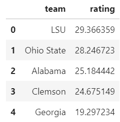
Output should look similar to above. Note that these ratings were run prior to the National Championship game between LSU and Clemson. We have our SRS ratings loaded, but what about team talent? Luckily, the CFBD API provides this data via its /talent endpoint.
response = requests.get(
    "https://api.collegefootballdata.com/talent",
    params={"year": 2019}
)

talent = pd.read_json(response.text)[['school', 'talent']]
talent.head()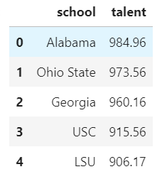
Lastly, we'll go ahead and join our SRS and team talent data into a single data frame to be used in our chart.
teams = srs.merge(talent, left_on='team', right_on='school')[['team', 'rating', 'talent']]
    teams.head()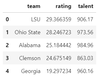
That looks great! We now have everything we need to go ahead and generate a scatter plot. We'll pass this data frame into Plotly Express and specify which columns we want to use for our x- and y- axes. I'm going to plot talent on the x-axis since this is our independent variable, thus making SRS rating our dependent variable and plotting it on the y-axis. We can do all this in two lines of code: one to create the chart and another to render it.
fig = px.scatter(teams, x="talent", y="rating")
fig.show()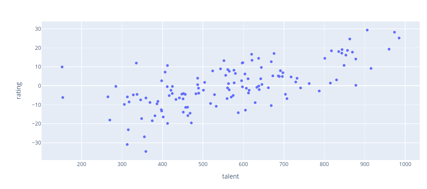
I really like that, however something is missing. Let's go ahead and add a title. I'm also going to give more descriptive names to our axis labels. You can also see that there definitely seems to be some sort of correlation between team talent and SRS rating. How about adding a trend line to our data as well.
fig = px.scatter(teams, x="talent", y="rating", trendline="ols")
fig.update_layout(
    title="Team Talent vs SRS Rating (2019)",
    xaxis_title="Talent Rating",
    yaxis_title="SRS Rating")
fig.show()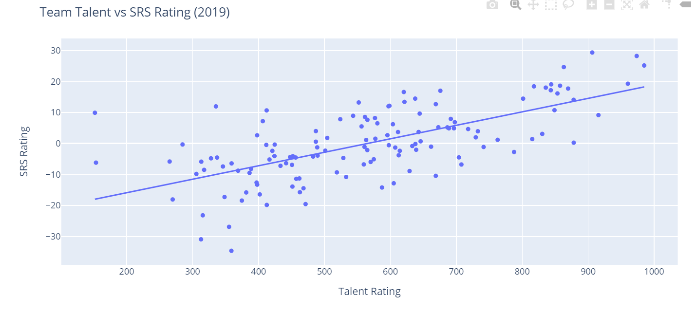
I like it even more! Notice how easy it was to add a trend line to our chart? Plotly provides two types of trend lines out of the box. We've used ols here, which is short for Ordinary Least Squares regression. This is primarily used for linear data, but Plotly also provides a function for non-linear data called LOWESS. Just for curiosity's sake, let's see what our data would look like with a LOWESS trend line. Just replace trendline="ols" with trendline="lowess" up above.
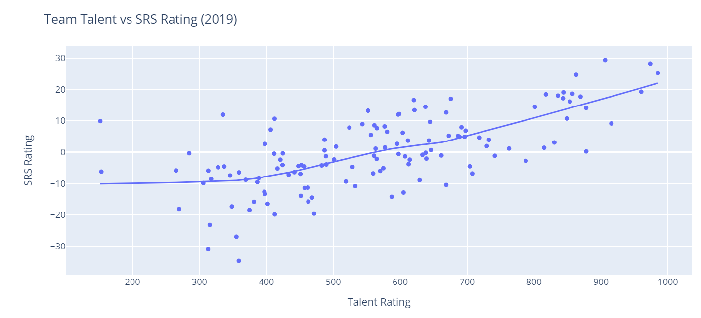
Since I think it's pretty clear that this is a linear relationship, I'm going to switch back to using OLS regression in subsequent charts. Let's go ahead and add some more information to our chart. It might be interesting to see how different conferences are classified on the chart. We'll use the CFBD API's /teams/fbs endpoint to grab team conference labels and merge it into our main data set.
response = requests.get("https://api.collegefootballdata.com/teams/fbs");
data = pd.read_json(response.text)

teams = teams.merge(data, left_on='team', right_on='school')[['team', 'conference', 'rating', 'talent']]
teams.head()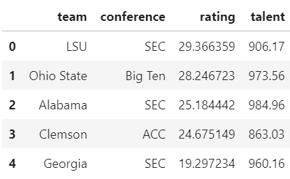
Perfect. Now, let's go head and add this to our chart. We'll add a color classification for conferences. This is, again, pretty simple to do. Let's leave off our trend line for now.
fig = px.scatter(teams, x="talent", y="rating", color='conference')
fig.update_layout(
    title="Team Talent vs SRS Rating (2019)",
    xaxis_title="Talent Rating",
    yaxis_title="SRS Rating")
fig.show()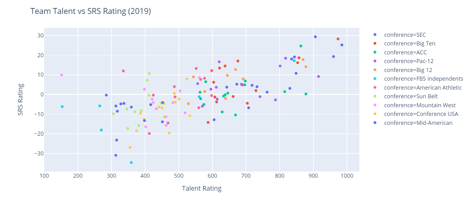
That's pretty noisy, isn't it? With 11 different conference classifications, it makes our chart a little difficult to decipher. Perhaps it would provide more value to classify between Power 5 and Group of 5 schools rather than getting granular down to the conference level. Let's add a new column to our data frame. If a school belongs to a Power 5 conference or is Notre Dame, we'll classify it as "P5+ND". Otherwise, we'll label it as "G5".
teams['classification'] = np.where((teams['conference'] == 'SEC') | (teams['conference'] == 'Big Ten') | (teams['conference'] == 'ACC') | (teams['conference'] == 'Pac-12') | (teams['conference'] == 'Big 12') | (teams['team'] == 'Notre Dame'), 'P5+ND', 'G5')
teams.head()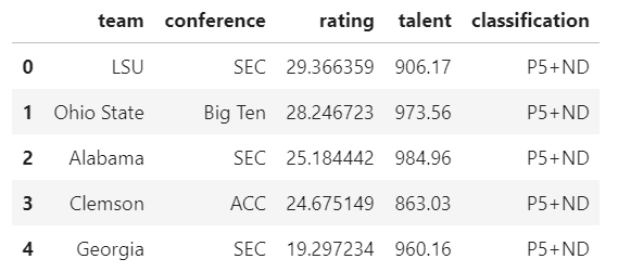
Now all that's left to do is plot it. We'll use code similar to before, but substituting our new column in for conference in the color parameter. Let's also add back in our OLS trend line.
fig = px.scatter(teams, x="talent", y="rating", color='classification', hover_name='team', trendline='ols')
fig.update_layout(
    title="Team Talent vs SRS  (2019)",
    xaxis_title="Talent Rating",
    yaxis_title="SRS Rating")
fig.show()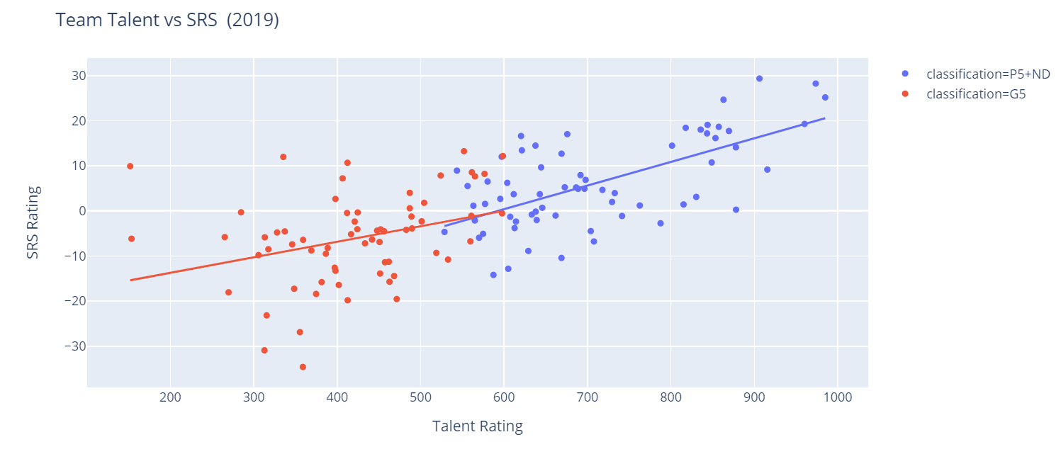
That looks pretty great, doesn't it? It's also interesting to see the pretty distinct separation between P5 and G5 schools when looking at talent. Notice also how our chart generate with two different trend lines. It would appear that talent plays slightly more of a role at the P5 level than it does for G5 schools. This is only one year, though. Let's get some more data.
The Team Talent Composite is available going back to 2015. I've also computed SRS values for all years in this timeframe. Again, it should be pretty easy to grab the talent data using the CFBD API; just omit the year parameter.
response = requests.get(
    "https://api.collegefootballdata.com/talent"
)

talent = pd.read_json(response.text)
talent.head()
Pulling in the SRS data is going to be a little less straightforward, but still pretty easy. We just need to first create an empty data frame and then loop through all years in this time frame, load up the CSV for that year, and concatenate the data into our new data frame.
srs = pd.DataFrame(columns=['year', 'team', 'rating'])
for year in range(2015,2020):
    srs_year = pd.read_csv('./data/srs_{0}.csv'.format(year))
    srs_year['year'] = year
    srs = pd.concat([
        srs,
        srs_year[['year', 'team', 'rating']]
    ])

srs.head()
We should be pretty good to go. We just need to again merge our team talent data with our SRS data to get a single data frame to work with.
teams = talent.merge(srs, left_on=['year', 'school'], right_on=['year', 'team'])[['year','team','talent','rating']]
teams.head()
Let's also not forget to add our conference data and compute P5/G5 classifications. We have a previous data frame named "data" which is still housing our conference data, so we can re-use that.
teams = teams.merge(data, left_on='team', right_on='school')[['year', 'team', 'conference', 'rating', 'talent']]
teams['classification'] = np.where((teams['conference'] == 'SEC') | (teams['conference'] == 'Big Ten') | (teams['conference'] == 'ACC') | (teams['conference'] == 'Pac-12') | (teams['conference'] == 'Big 12') | (teams['team'] == 'Notre Dame'), 'P5+ND', 'G5')
teams.head()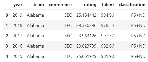
After verifying that our data is in the format that we expect, we can go ahead and regenerate the last chart from above using this bigger set of data. I'm also going to add some hover data to my chart. Namely, I want to see both the team name and the season value when I hover over points on my plot. The code should look pretty familiar by now.
fig = px.scatter(teams, x="talent", y="rating", color='classification', hover_name='team', hover_data=['year','talent','rating'], trendline='ols')
fig.update_layout(
    title="Team Talent vs SRS  (2015-2019)",
    xaxis_title="Talent Rating",
    yaxis_title="SRS Rating")
fig.show()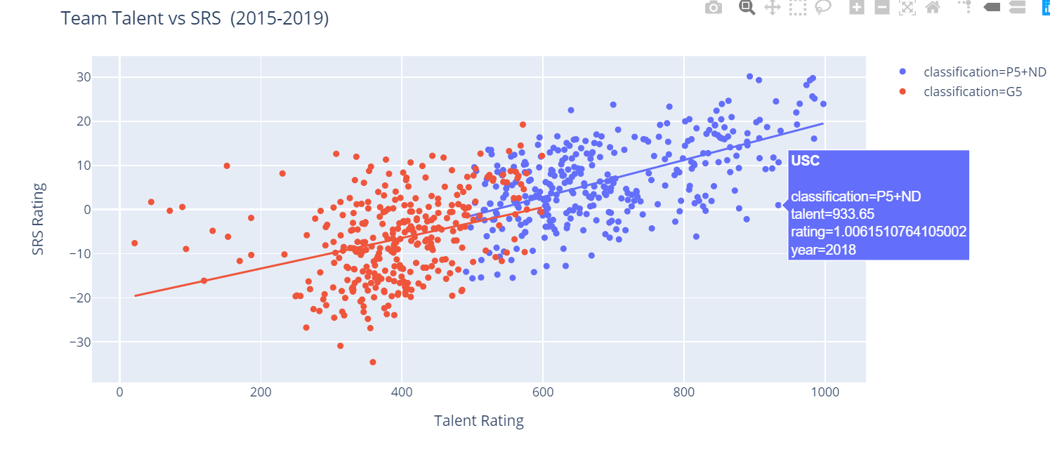
Now, that looks fantastic. We can clearly see that there's a relation between team talent level and SRS rating. Talent level obviously isn't the entire picture, but we can clearly see that it has a direct affect on a team's floor and ceiling by looking at the chart.
There are so many different ways we can go from here, but I'll leave you to experiment on your own. Before we finish up, there is one little neat bit of functionality we should check out. We've already spent some time discussion trend lines and how to generate them. What if I want to view statistics on the regressions Plotly is running in order to render this piece of data? You can view some details just by hovering on a trend line in one of the charts, but Plotly Express provides some additional functionality if you would like to take a deeper dive. In this instance, let's look at the trend line for our P5+ND classification.
results = px.get_trendline_results(fig)
results.query("classification == 'P5+ND'").px_fit_results.iloc[0].summary()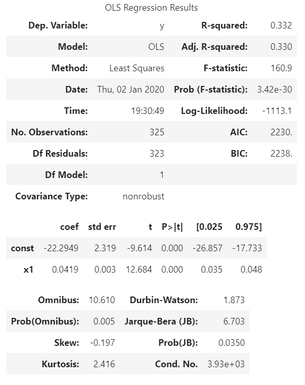
So that's a neat bit of functionality if you want to get into the nitty-gritty of the math involved in generating these lines.
Conclusion
By now, you should have a good idea of how to use Plotly to generate charts for your data. As always, I highly recommend experimenting some more own your own. Some example exercises that may be of interest:
- Are there any other ways to represent or classify this data? Any other conclusions we can draw?
- Are there any consistent notable outliers? What happens if we filter these out? Does it make a difference? Can we think of any reasons for some schools to consistently be outliers in the data?
- Could we represent this data or parts of it in different ways? What insights could we generate from utilizing different types of charts in the Plotly reportoire?
So get out there and get tinkering. And if you come up with anything interesting, please do share! I love seeing what people come up with.
Until next time!