
Talking Tech: Creating Charts with matplotlib

In one of my earlier blog posts, I wrote a guide on creating charts using the (at the time) nascent CFBD Python library and a charting library/platform called Plotly. I was still relatively new to Python myself and was trying to sort out the ecosystem of Python charting libraries. Indeed in that very post, I noted that there was a wide array of different options. Ultimately, I settled on Plotly due to its ease of use, large feature set, and fantastic documentation. I still think that Plotly is a fantastic library for those very reasons. It offers a lot out of the box with a relatively minimal level of fiddling. In recent years, however, I have gravitated towards a different charting library that has since usurped Plotly as my charting library of choice: matplotlib.
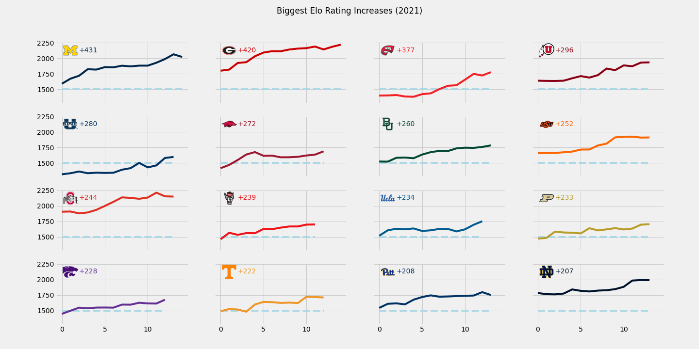
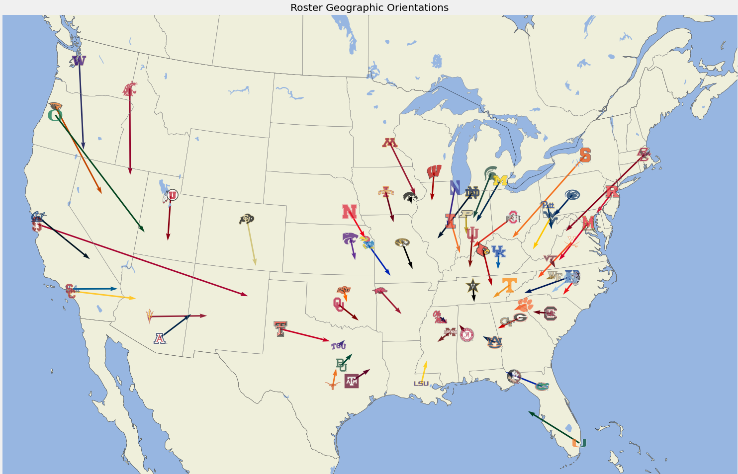
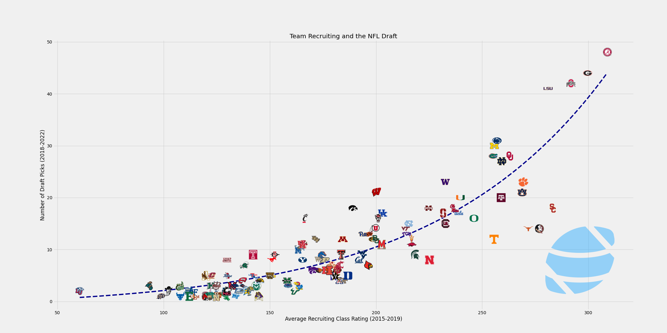
The primary reason I've grown to love matplotlib is that it's very customizable. I've found that I've been able to do just about anything I've been able to draw up in my own imagination. Due to its versatility, things are not always as straightforward as they are with Plotly but I've found I've been able to do much, much more. Before we dive in deeper, check out some of the charts I've been able to generate with matplotlib.
I initially grew frustrated with Plotly when I was trying to create plots that had logos, which apparently Plotly can't really do. This is when I really started using matplotlib and discovered how to do all kinds of advanced stuff like you see above. If you want to learn how to get started doing some of this, keep on reading!
Let's get charting
Edit: The Jupyter notebook used in this guide has been uploaded to GitHub if you would like to use it to follow along.
First off, we'll assume you have a Python environment setup, preferably using Jupyter notebooks. We'll begin by importing the libraries that we need, starting with the standard ones: cfbd, pandas, and numpy. I don't always end up using numpy but I usually always import it anyway because you never know. We'll also import matplotlib.
import cfbd
import numpy as np
import pandas as pd

import matplotlib.pyplot as plt
matplotlib is pretty standard in any Jupyter or data science environment, so you should have it. If not and you get an error above, then open up a terminal and install the matplotlib package and then run the import statement again.
pip install matplotlib
Next up, we'll configure the cfbd Python library so we can make some calls. Be sure to replace the placeholder below with your personal API key.
config = cfbd.Configuration(
    access_token = 'YOUR_API_KEY'
)
client = cfbd.ApiClient(config)
Now let's grab some data that we can turn into a chart. We'll grab team Elo and SP+ ratings from the end of the 2022 season and put these into a scatterplot. Run the code below to get the data.
ratings_api = cfbd.RatingsApi(client)
elo_ratings = ratings_api.get_elo(year=2022)
sp_ratings = ratings_api.get_sp(year=2022)
Let's take a look at the format of the data that was returned from the API.
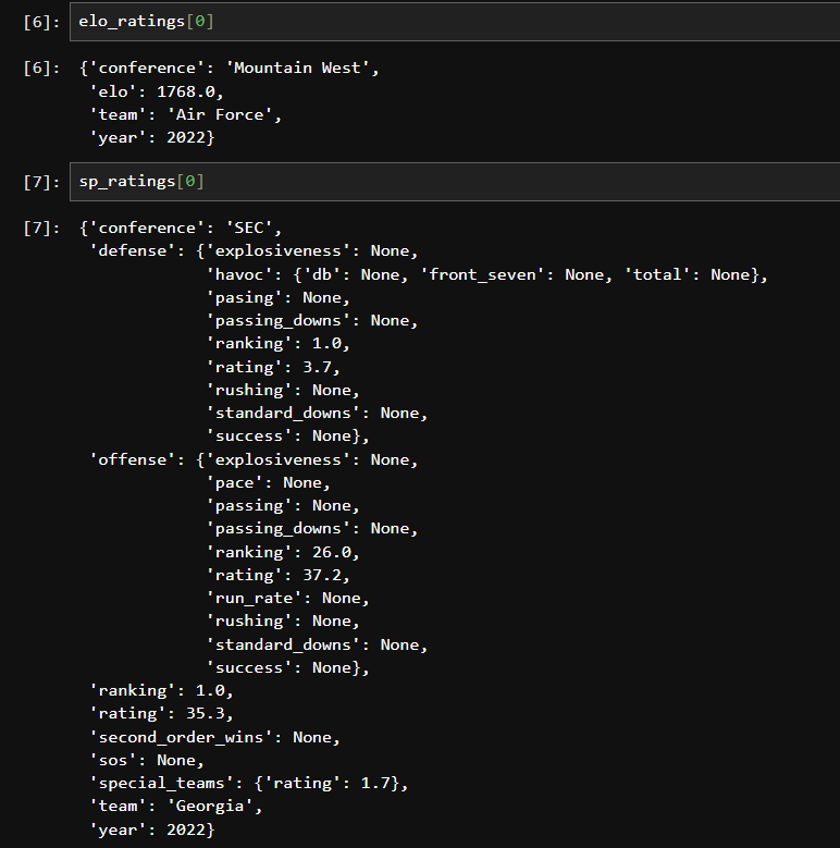
The Elo rating object is pretty simple. It's just a flat object consisting of team, year, conference, and the team's final Elo rating. The SP+ object is a bit more complex with some nesting. We really only care about the top-level properties for team and overall rating. We also want to combine these lists, but first let's convert them int DataFrames that can be merged.
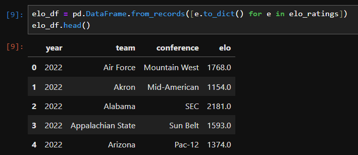
Here's the code for converting the list of Elo ratings.
elo_df = pd.DataFrame.from_records([e.to_dict() for e in elo_ratings])
elo_df.head()
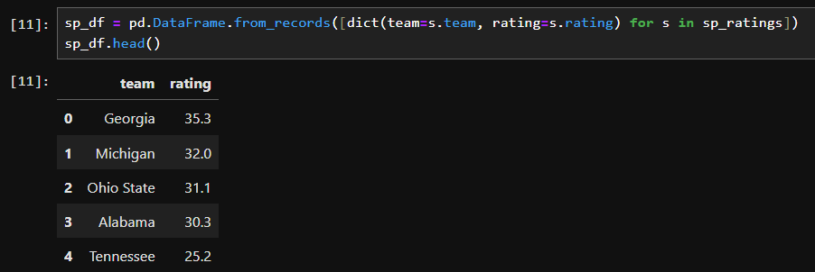
When converting the SP+ ratings to a DataFrame, we're only going to grab the properties we care about (team and rating).
sp_df = pd.DataFrame.from_records([dict(team=s.team, rating=s.rating) for s in sp_ratings])
sp_df.head()
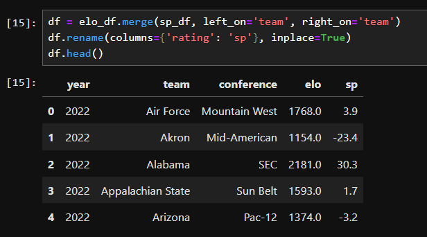
Now we can merge these together into a single DataFrame. I'm also going to rename the rating column to sp to make it things more clear in the data.
df = elo_df.merge(sp_df, left_on='team', right_on='team')
df.rename(columns={'rating': 'sp'}, inplace=True)
df.head()
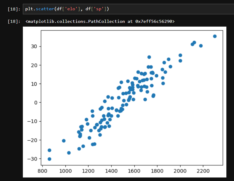
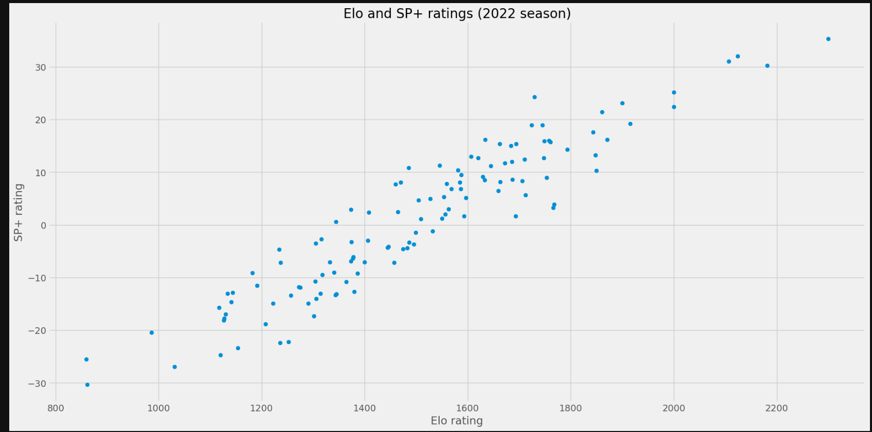
We can now generate a scatterplot. We'll plot Elo ratings on the x-axis and SP+ ratings on the y-axis. This is super easy.
plt.scatter(df['elo'], df['sp'])
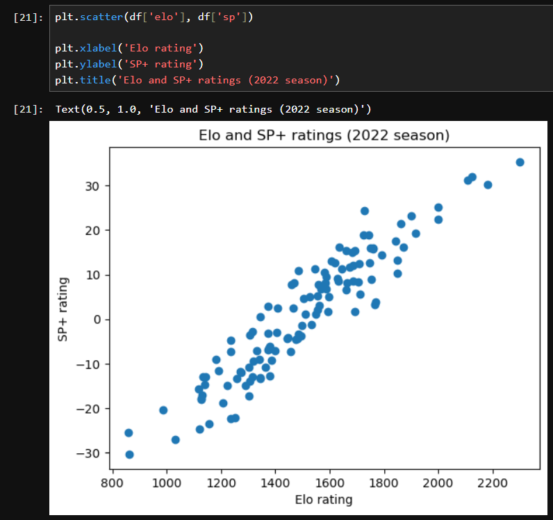
Good charts should always have a title and labels, so let's add some of those and regenerate the chart.
plt.scatter(df['elo'], df['sp'])

plt.xlabel('Elo rating')
plt.ylabel('SP+ rating')
plt.title('Elo and SP+ ratings (2022 season)')
Pretty easy, huh?
Jazzing Things Up
These charts look a little... bland? Don't you think? Let's look at jazzing things up a bit.
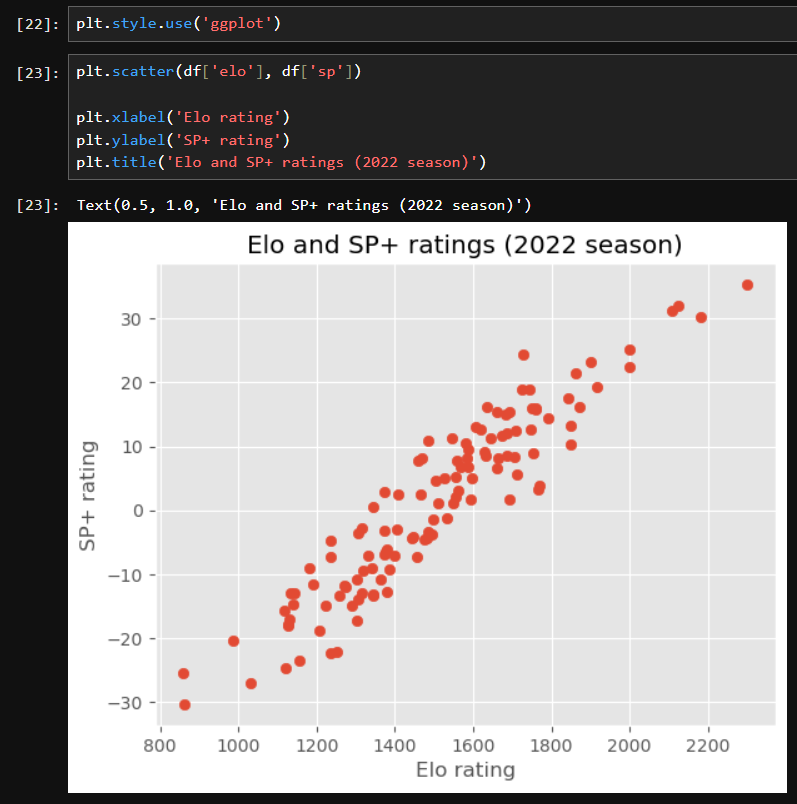
I mentioned that matplotlib is highly customizable. As a result, it can be heavily themed using style sheets. Luckily, it has several builtin themes out of the box. I recommend checking them all out.
A popular option is the ggplot theme, inspired by the famous R charting library. Let's check that one out.
plt.style.use('ggplot')
And then just rerun our chart code.
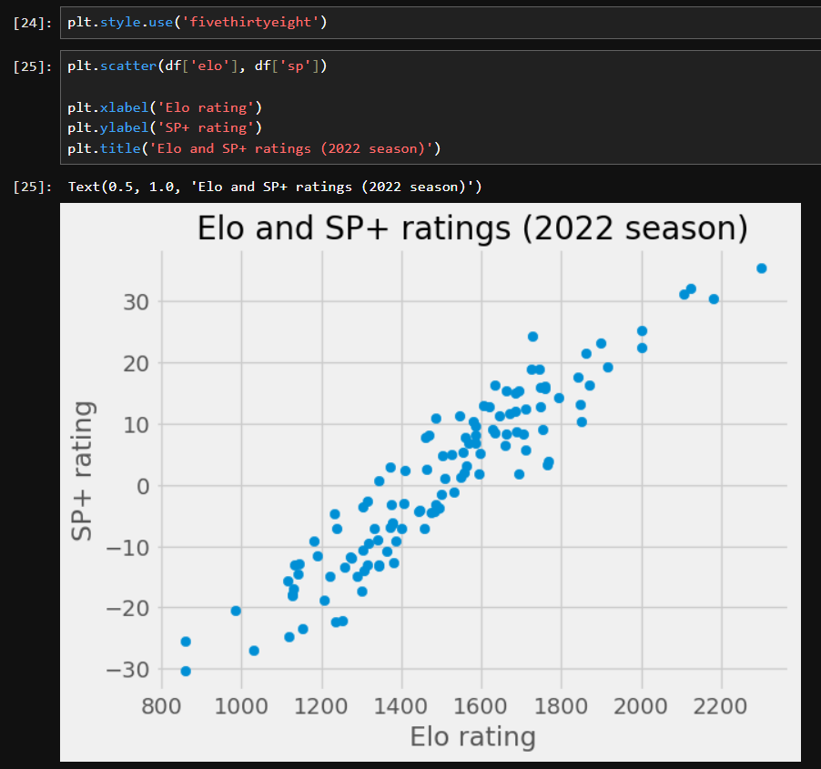
Personally, I'm partial to the fivethirtyeight theme, inspired by the charts from FiveThirtyEight.com.
plt.style.use('fivethirtyeight')
We can also easily manipulate the size and dimensions of charts. For example,
plt.rcParams["figure.figsize"] = [20,10]
We can also easily export charts to an image file format, such as PNG. Just add a call to savfig() with the name of the file you want to save to.
plt.scatter(df['elo'], df['sp'])

plt.xlabel('Elo rating')
plt.ylabel('SP+ rating')
plt.title('Elo and SP+ ratings (2022 season)')

plt.savefig("test.png")
Adding Team Logos
I mentioned the ability to plot team logos as being the initial impetus for my looking at matplotlib and moving away from Plotly. So this post would be no good if I didn't show you how to do that. First off, we need one more line of imports.
from matplotlib.offsetbox import OffsetImage, AnnotationBbox
Secondly, we need some logo files. I have a collection of logos on a Google Drive that you can download here. These logos (after you download and unzip them) should be placed in the same directory as your Jupyter notebook or Python script in a folder called logos.
Next up, we are going to define a function for retrieving a logo based on a team name and creating an image object from it.
def getImage(team):
    return OffsetImage(plt.imread(f'./logos/{team}.png'))
We need to modify our scatterplot code above to utilize this function to plot team logos in place of points on the scatterplot. Go ahead and run this code. We'll break it all down in a second.
fig, ax = plt.subplots()
ax.scatter(df['elo'], df['sp'], alpha=0)

for index, r in df.iterrows():
    ab = AnnotationBbox(getImage(r.team), (r.elo, r.sp), frameon=False)
    ax.add_artist(ab)

plt.xlabel('Elo rating')
plt.ylabel('SP+ rating')
plt.title('Elo and SP+ ratings (2022 season)')
If you added the logo directory properly, this is what should have been rendered:
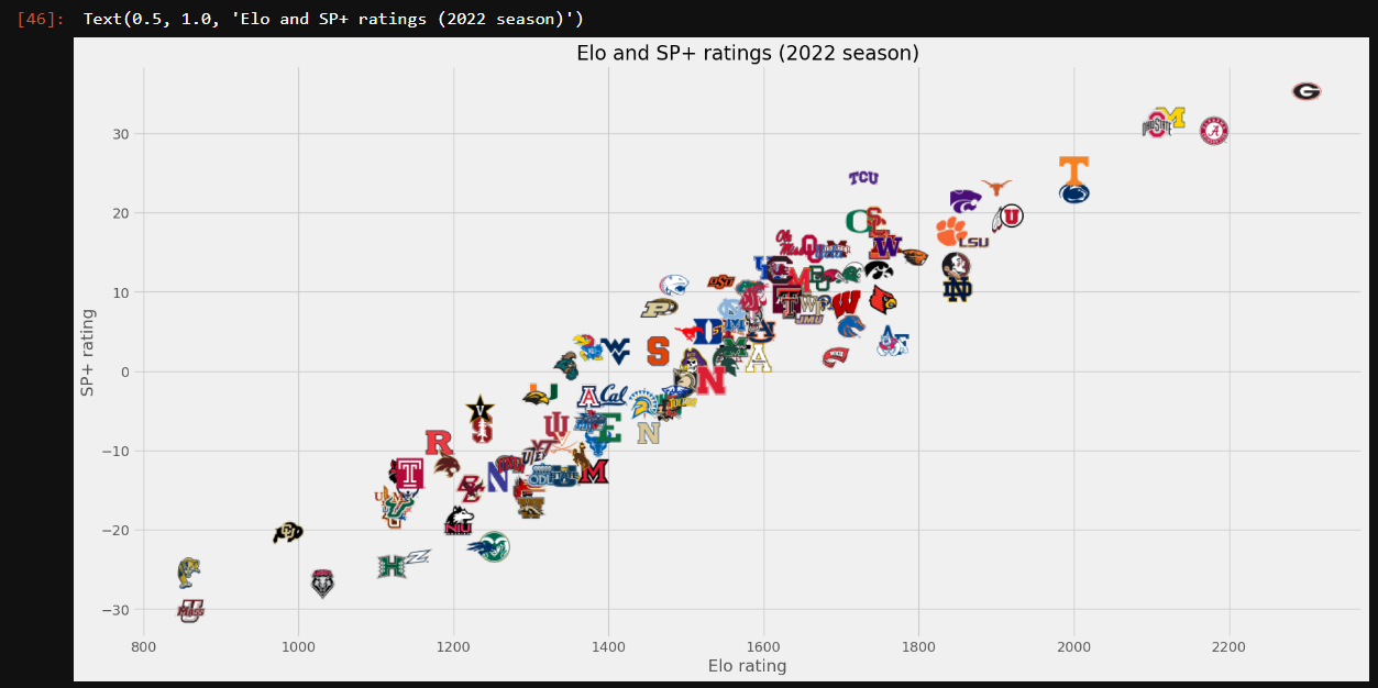
Okay, let's break down the changes to our scatterplot code.
fig, ax = plt.subplots()
Instead of working directly off of the plt object, we called the subplots function, which allows multiple plots to be plotted in the same figure. We don't need subplot functionality here, but what's important is that this returned figure object (fig) and an Axes object (axes) which can both be used for various customizations. This is usually how you'll generate a chart instead of using plt directly.
ax.scatter(df['elo'], df['sp'], alpha=0)
There are two deviations here. First, we are calling scatter on the ax object instead of on plt. Secondly, we are setting an alpha property to 0. This is effectively making the plotted points invisible. We do not need the normal points to display because we will be adding team logos in their place.
for index, r in df.iterrows():
    ab = AnnotationBbox(getImage(r.team), (r.elo, r.sp), frameon=False)
    ax.add_artist(ab)
This block contains the meat of the changes. We are iterating through all of the rows in the DataFrame and creating an annotation box that consists of the team logo. In constructing the annotation box (AnnotationBbox), we are passing in the logo image (created by our getImage function using the logo path), the coordinates where the logo should display (Elo rating as the x-coordinate and SP+ rating as the y-coordinate), and setting a property to turn off the image frame (which would otherwise draw an ugly border around each logo).
Other types of charts
You can use matplotlib to create just about any type of chart: line charts, pie charts, bar charts, and more. We won't go into every one of these but let's check out a line chart.
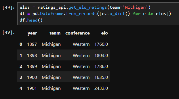
We've already used the Elo ratings API endpoint let's use that to get historical data for a single team and put that into a line chart. I'm a Michigan guy so that's the team I'll be using, but feel free to substitute in your favorite team.
elos = ratings_api.get_elo(team='Michigan')
df = pd.DataFrame.from_records([e.to_dict() for e in elos])
df.head()
And let's go ahead and create a line chart.
fig, ax = plt.subplots()

ax.plot(df['year'], df['elo'], color='#00274c')

plt.xlabel('Year')
plt.ylabel('Elo rating')
plt.title('Historical Elo Rating (Michigan)')
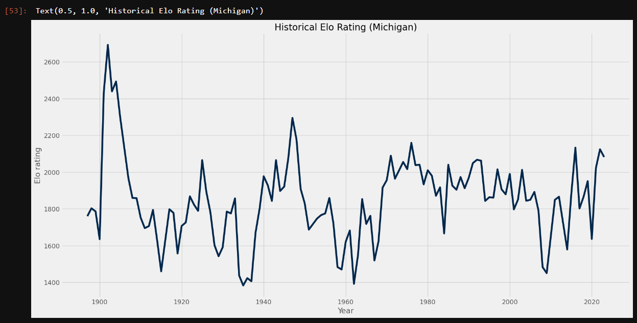
Only two real minor changes from our previous code here. First, we're calling the plot function to generate a line chart whereas previously we were calling scatter for scatterplots. And then notice that passed in a color parameter to style the line to be in the team's primary color.
How about we add the team logo as a sort of watermark somewhere on the chart?
fig, ax = plt.subplots()

ax.plot(df['year'], df['elo'], color='#00274c')

logo = OffsetImage(plt.imread('./logos/Michigan.png'), zoom=1.5)
ab = AnnotationBbox(logo, (2020, 2600), frameon=False)
ax.add_artist(ab)

plt.xlabel('Year')
plt.ylabel('Elo rating')
plt.title('Historical Elo Rating (Michigan)')
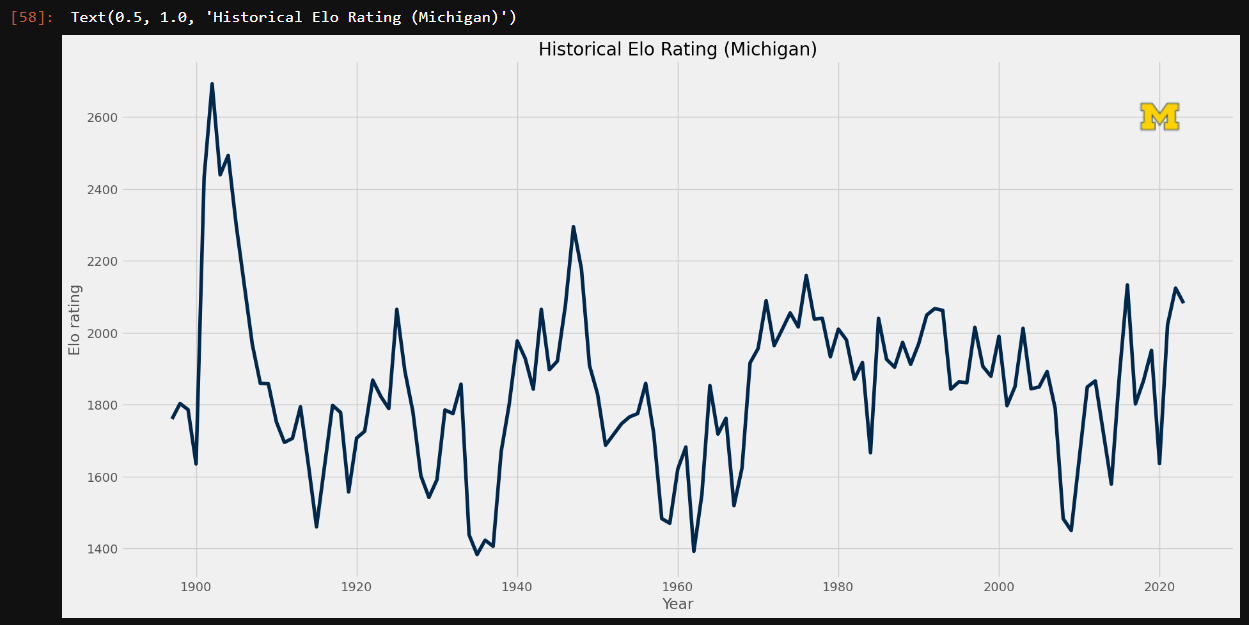
Note that lines 5-7 are almost identical to the code we used in the getImage function and to plot team logos as scatterplot points. In this example, I am plotting the logo in the upper right corner of the graph. I just had to pass in the actual graph coordinates where I wanted the image to go, (2020, 2600) in this example.
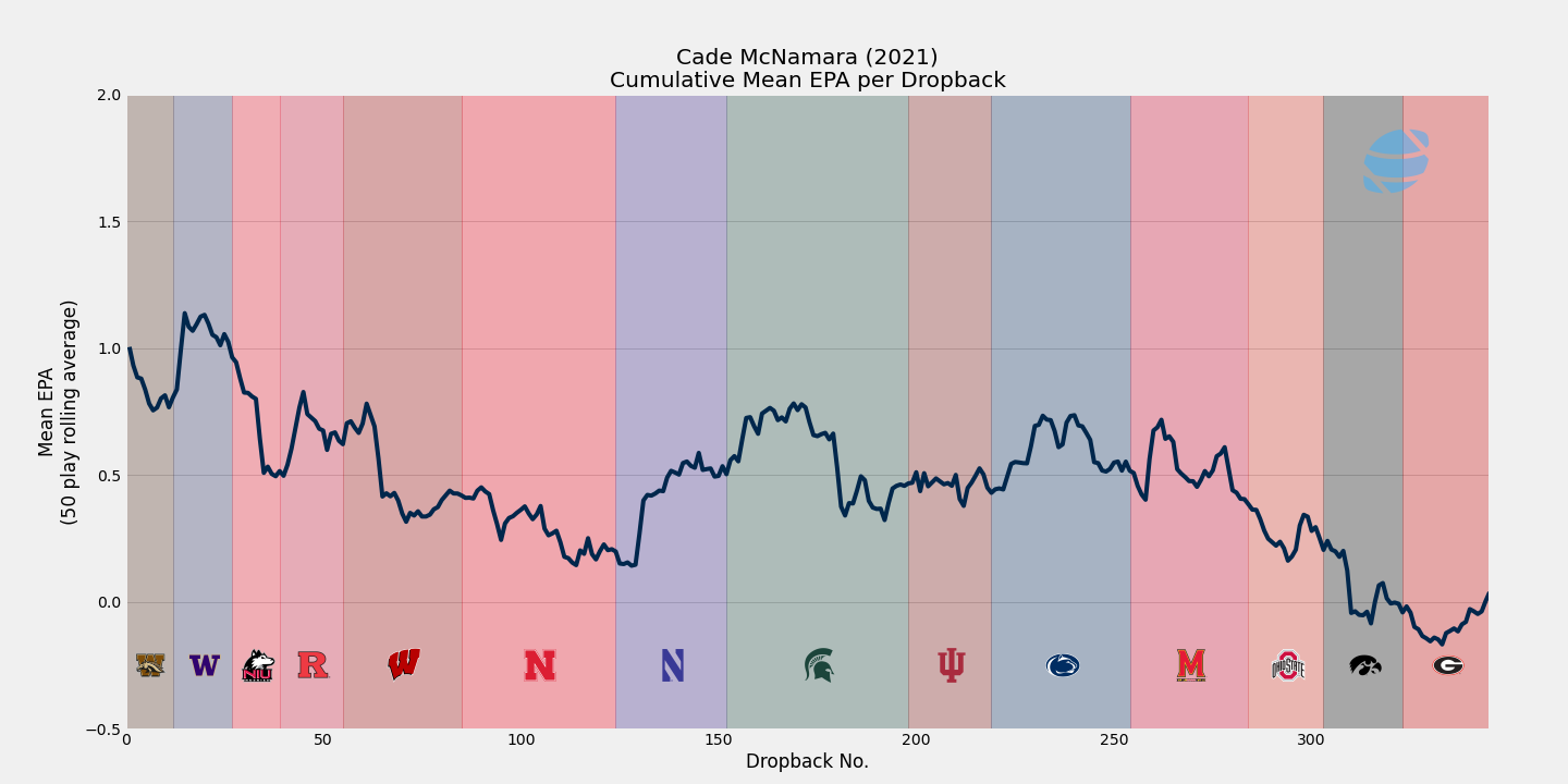
Let's say I wanted to highlight a particular range of years, in this case the tenure of a significant coach in the program's history.
fig, ax = plt.subplots()

ax.plot(df['year'], df['elo'], color='#00274c')

logo = OffsetImage(plt.imread('./logos/Michigan.png'), zoom=1.5)
ab = AnnotationBbox(logo, (2020, 2600), frameon=False)
ax.add_artist(ab)

ax.axvspan(1969, 1989, alpha=0.5, color="#FFCB05")
ax.text(1974, 1400, '    1969-1989\nBo Schembechler', va='center', fontstyle='italic', fontsize='small')

plt.xlabel('Year')
plt.ylabel('Elo rating')
plt.title('Historical Elo Rating (Michigan)')
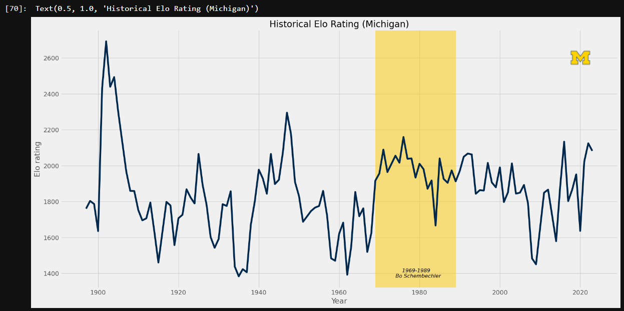
Line 9-10 are the only additions here. On line 9, I added a vertical span across the x-values 1969 to 1989, filled it in with the team's secondary color, and added some transparency.
Now suppose there's a specific point on the chart I want to call out, maybe with some text and an arrow annotation. This is how I'd do that.
fig, ax = plt.subplots()

ax.plot(df['year'], df['elo'], color='#00274c')

logo = OffsetImage(plt.imread('./logos/Michigan.png'), zoom=1.5)
ab = AnnotationBbox(logo, (2020, 2600), frameon=False)
ax.add_artist(ab)

ax.axvspan(1969, 1989, alpha=0.5, color="#FFCB05")
ax.text(1974, 1400, '    1969-1989\nBo Schembechler', va='center', fontstyle='italic', fontsize='small')

ax.annotate("Fielding Yost\nPoint-a-Minute teams",
            xy=(1903, 2700), xycoords='data',
            xytext=(1940, 2600), textcoords='data',
            arrowprops=dict(facecolor='#FFCB05'),
            horizontalalignment='center', verticalalignment='top')

plt.xlabel('Year')
plt.ylabel('Elo rating')
plt.title('Historical Elo Rating (Michigan)')

Lines 12-16 here are the additions. This is the basic format for adding an arrow annotation. Using the annotate function, I specified the text, where the arrow should point, where the arrow should end, some styling for the arrow color (using the team's secondary color again), and some alignment properties. Notice how for xycoords and textcoords we specified the data option. This tells the figure how to render these annotations. In this case, we are just going by the chart's coordinate system. There are several other options for specifying these locations, but those are outside of the scope of the article. I highly recommend looking into them on your own.
Further Steps
We've covered the basics of matplotlib. Hopefully it's given good insight into its versatility and power. While this post should give you some good building blocks to get started creating your own charts, we've really only touched the surface. We really only hit on scatter and line charts and there's a plethora of other chart types you can create. You can also create animated charts! Maybe that will be blog post down the road. Here are some more resources which should help you expand upon what we've gone through here.